Full Guide to Image Optimization and How to Improve Website Performance (Core Vitals) Through Image Compressing and New Formats
We've put together the most complete guide on image optimization for widely used formats like PNG, JPG, SVG, GIF, etc as well as detailed information on the new formats for web use (webP and AVIF), and how these techniques can improve your website loading time and web vitals scores.

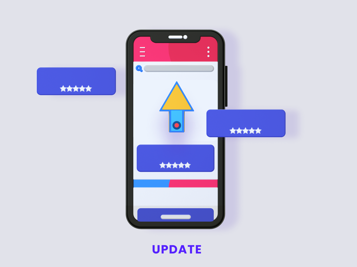 Illustration from
3D Icons by Iconshock
Illustration from
3D Icons by IconshockOver the years, Google has been putting increased emphasis on website performance when it comes ranking them higher in their search engine's results - this is most evident in their Page Experience Update, which aims to measure how users experience their interactions with a web page, and ranks websites based on these metrics.
These updates included Core Web Vitals, the specific metrics that play a vital role for measuring UX (user experience) which, among other things, include a page's loading speed, performance, visual stability, responsiveness and interactivity.
Now, there are many ways in which you can optimize a website's SEO and get it to rank higher on Google's search results, and this has typically been done through content.
Adding pages to your website with content focused on the primary keywords that the users you want to acquire would be looking for, and engaging them enough so that they'll keep coming back for more, has been the single most important aspect of search engine optimization for years now.
This remains true even now after the Page Experience Update -content is king and will remain so for the foreseeable future- however, with the inception of Core Web Vitals, some of the more arcane aspects of web design have taken a front seat, and currently play a bigger role into ranking a website in search engine results than ever before, since Google's search algorithm will now take into account a website's UX to score and rank a website in its search engine results.
As the dust settles, and while there is a lot of ground to cover, we will do our best to bring you an in-depth guide that will help you get a better understanding of what these metrics are, and how to optimize them for the better. We will be taking a detailed look at image optimization, since we believe this is a major sticking point for many website owners that is often overlooked, but should be carefully taken considered in order to improve your website's UX, and by extension, your SEO rankings.
In this guide:
- What are Core Web Vitals - Basic Concepts
- Tips to optimize your UX
- In-depth guide to image optimization
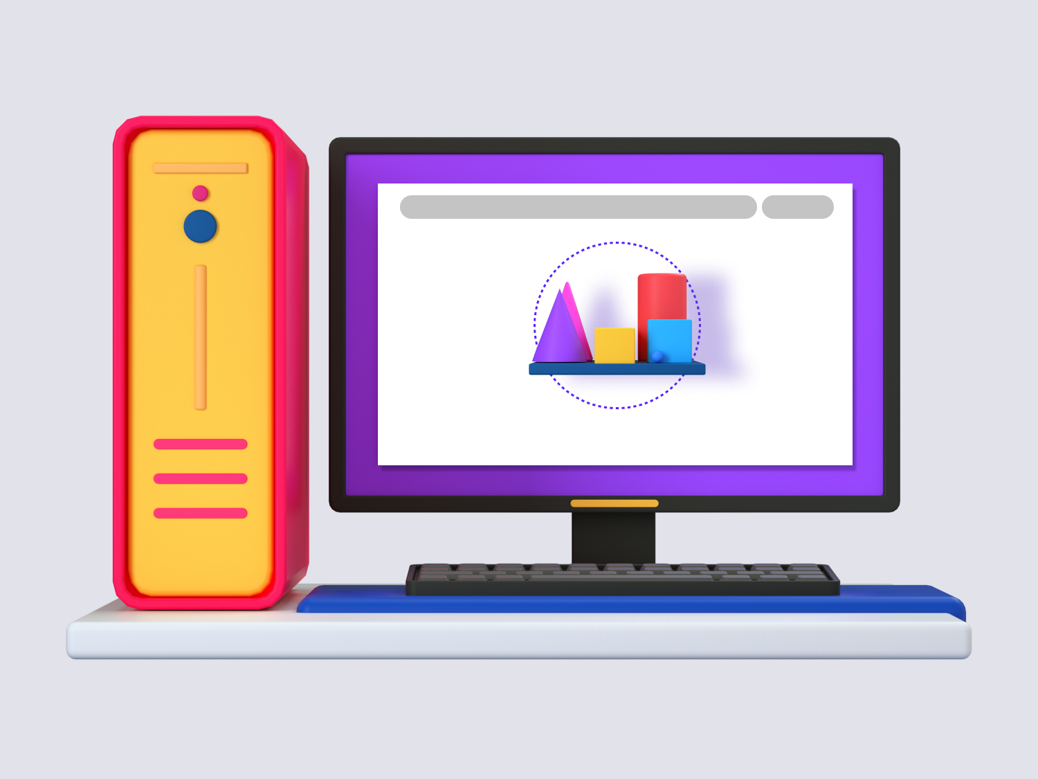 Illustration from
3D Icons by Iconshock
Illustration from
3D Icons by IconshockWhat are Core Web Vitals?
Core Web Vitals are the group of signals that measure a user's experience when they're interacting with a website - they measure the speed at which your website loads, how fast it serves content to the user, how long it takes for the user to be able to interact with the page, and then ranks your page based on the scores you receive in each category.
Imagine loading into a website and, just when you're about to click or tap a menu, the layout suddenly shifts due to some elements of the layout loading faster/slower than other elements, and you end up taking an unintended action instead, like opening a different product instead of the one you want to see, or clicking an ad.
Or reading a text that describes an image above or below the paragraph, but the image takes too long to load and you can't get an idea of what exactly you're supposed to be looking at.
Or loading into a page and not being able to take actions due to overlapping UI elements.
These scenarios and many others will all be measured and quantified by the Core Web Vitals.
In order to improve your score in these metrics, you must provide your users with an improved experience when they're navigating your website. Sounds simple enough right?
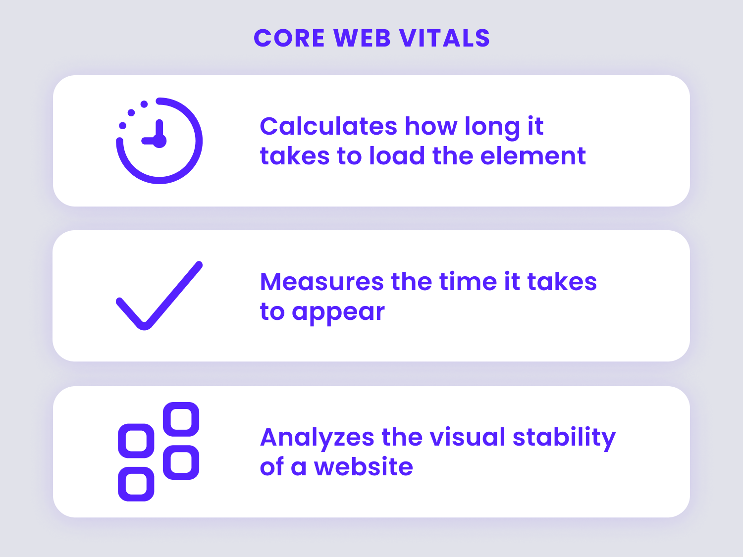
There are three main core web vitals, which, roughly speaking, measure performance, responsiveness, and visual stability. These are:
- Largest Contentful Paint (LCP) - measures the time it takes for the largest elements of a website such as images and videos to fully load.
- First Input Delay (FID) - measures how responsive a page is for users when they load into it for the first time, or, in other words, how quickly your website's interactive elements respond to user input.
- Cumulative Layout Shift (CLS) - measures the quality of a website's layout, or "visual stability", to ensure there are no sudden or unexpected shifts in the layout when a page is finished loading.
Lucky for us, Google also provides some tools that will help you optimize Core Web Vitals, among them, a Core Web Vitals report tool that you can access through your Google Search Console, which shows a website URL performance grouped by status, metric type, and URL group (groups of similar web pages).
With all this in mind let's take a second look at each of the scores and, more specifically, the values that you should strive for in each one of the big three metrics:
Your LCP should occur within the first 2.5 seconds when the page starts to load.
Your FID should be less than 100 miliseconds.
Your CLS score should be under 0.1
If you can maintain these scores (or even improve them further) you can be confident that you're providing your users with a great experience, therefore your website will rank higher and help you both in the short and the long term.
However, if your scores are higher, we've got some work to do, and optimizing a website to make sure these scores are met can be a daunting undertaking.
So, now that we've (very roughly) covered the basics about Core Web Vitals, let's take a look at some tips you can follow in order to optimize your Core Web Vitals scores in each category.
Improving your LCP Score
Broadly speaking, optimizing your LCP score boils down to reducing the "weight" of the data that gets sent to the user's browser. Here are a few steps you can follow in order to start reducing your LCP:
- Upgrading your server or your hosting service so that your download speeds remain fast at times of high usage.
- Cut content delivery times by using a CDN (Content Delivery Network) that is geographically closer to your users.
- Take a closer look at your old/unused website plugins and get rid of them.
- Trim your JavaScript and CSS files, optimize them as much as possible, and make sure to remove unused code from them.
- Remove render-blocking resources like scripts, CSS or HTML elements that delay the page content from being fully displayed.
- Implement effective content caching practices to prevent resending data, such as Lazy Loading.
- Optimize your images - below you will find a comprehensive guide on how to do this, but basically you'll want to reduce their file sizes and image dimensions where possible, and specify their dimensions within your HTML code as well as use appropriate/optimal image formats.
- Implementing Lazy Loading, Infinite Scrolling, or other methods to partially load images will also make a huge difference in your page's loading times.
Improving your FID Score
This is, generally speaking, a matter of optimizing your JavaScript code to remove redundancies, get tasks executed efficiently, and reduce the client-side resources necessary to render your page, so you could start by:
- Caching as much static content on the server as you can.
- Concatenate and minify your JavaScript and CSS files.
- Leave less important scripts like analytics, ads, and social media tools for last in the loading order.
- Use a progressive enhancement strategy to serve the content and basic function of the website quicker.
- Implement lazy-loading for JavaScript components that can slow down your website's speed (such as video players).
- Delay third-party JS such as analytics and social media (or host them locally).
Improving your CLS Score
You could say this comes down to a matter of specifying the space that certain elements will occupy before they load, thus reducing weird/unexpected layout changes that can interfere with the user's experience when they're already interacting with your website's content.
In order to reduce your CLS score you can start with the following:
- Specify the dimensions of every element such as
containers, advertisement widgets, images and videos,
within their respective HTML tags; doing this will
allocate room for these in the layout of a page before
they load, thus preventing unexpected shifts in the
layout that can negatively impact a user's experience.
Here's a quick example:
<img src="puppy.jpg" width="800" height="400 "alt="a photo of a puppy"/> - Apply the CSS aspect-ratio property to reserve space for elements before the assets download.
- Set appropriate dimensions for container elements enclosing slower-loading third-party content like advertisements and widgets.
- Make sure that assets like images and blocks of content that are located at the top of your page get requested as soon as possible.
- Use CSS transform and opacity for more efficient animations.
In-depth Guide to Image Optimization for Core Web Vitals
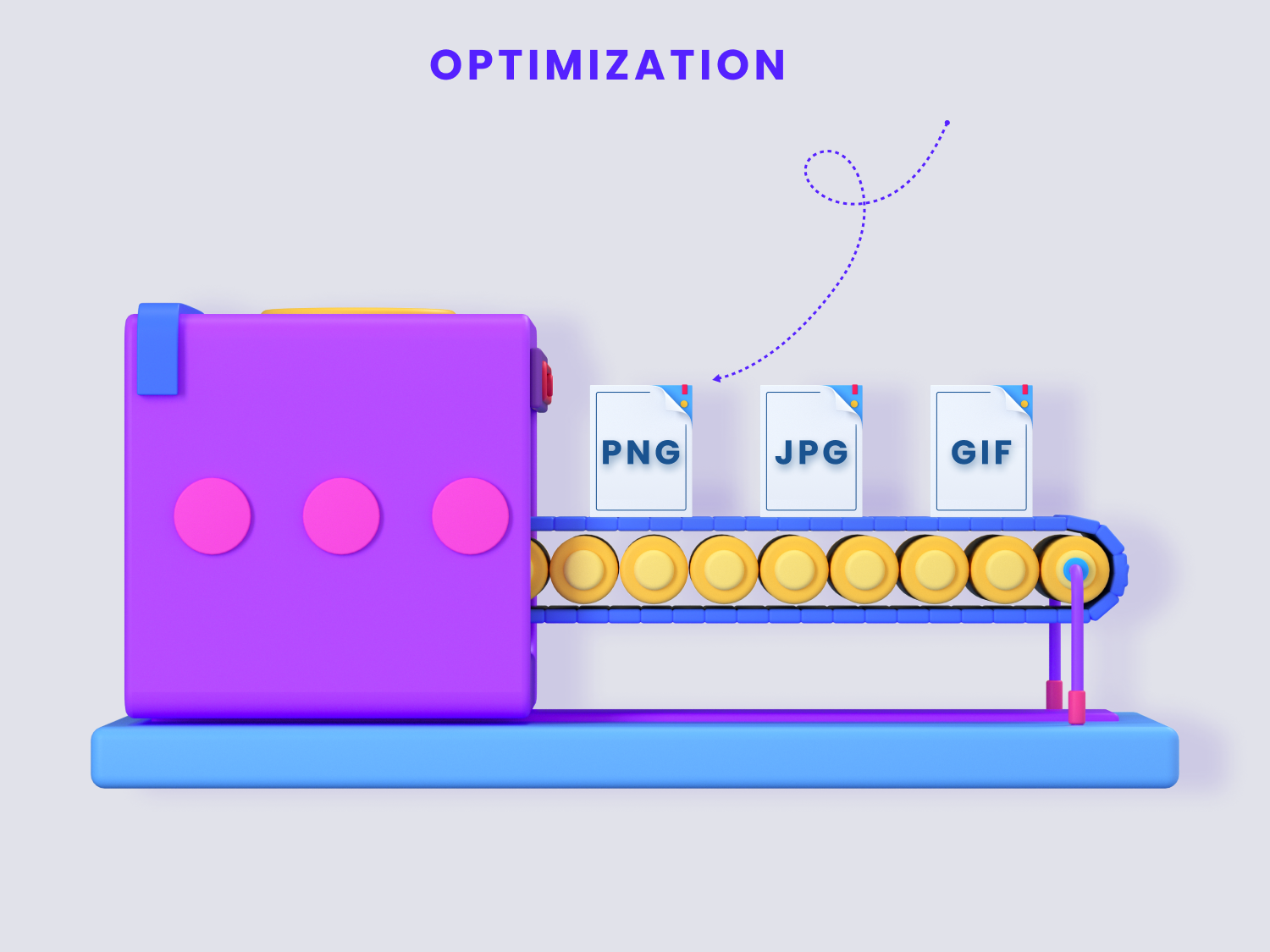 Illustration from
3D Icons by Iconshock
Illustration from
3D Icons by IconshockThere are many different image formats that help us show content in our websites. Some of them are more convenient than others. Others will load faster, and others will provide sharper image quality.
But this increase in the number of image formats available has also increased our confusion on which image format to use on our projects.
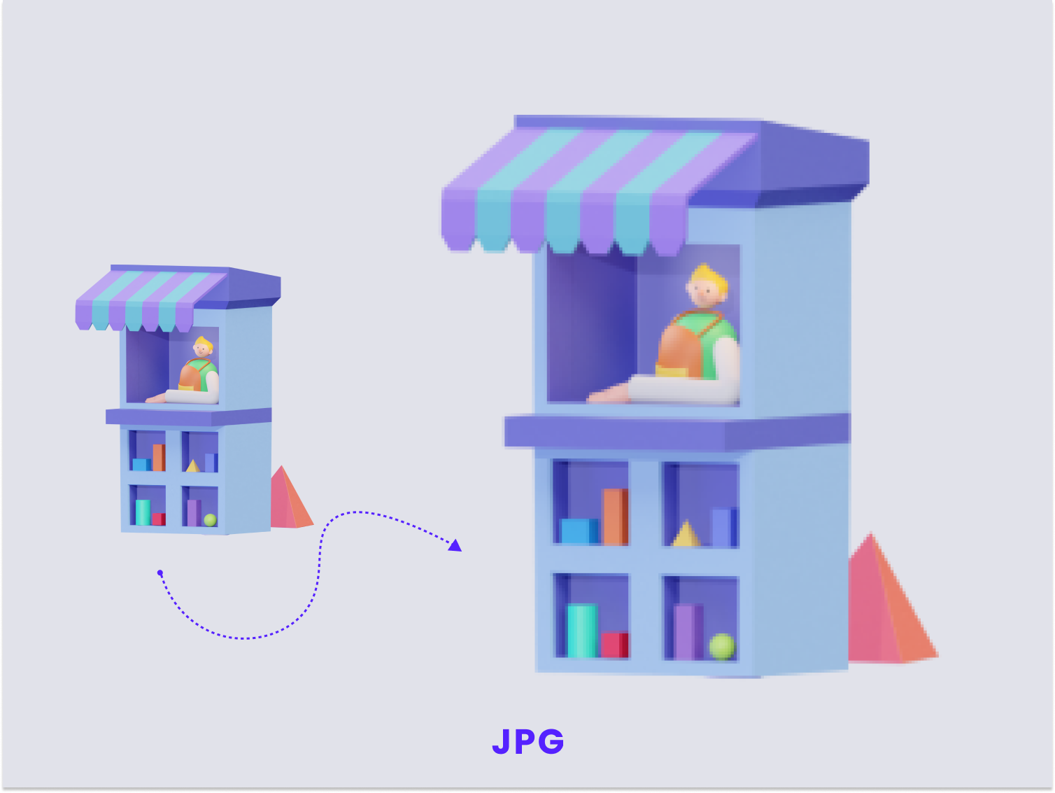
If you are unable to decide the image format for your web projects, then this section is for you. We'll take a closer look at the most commonly used image formats as well as newer image formats and will provide you with a ample information about each one of them so you can make an informed decision about which one to use for your content. Let's start from the very beginning.
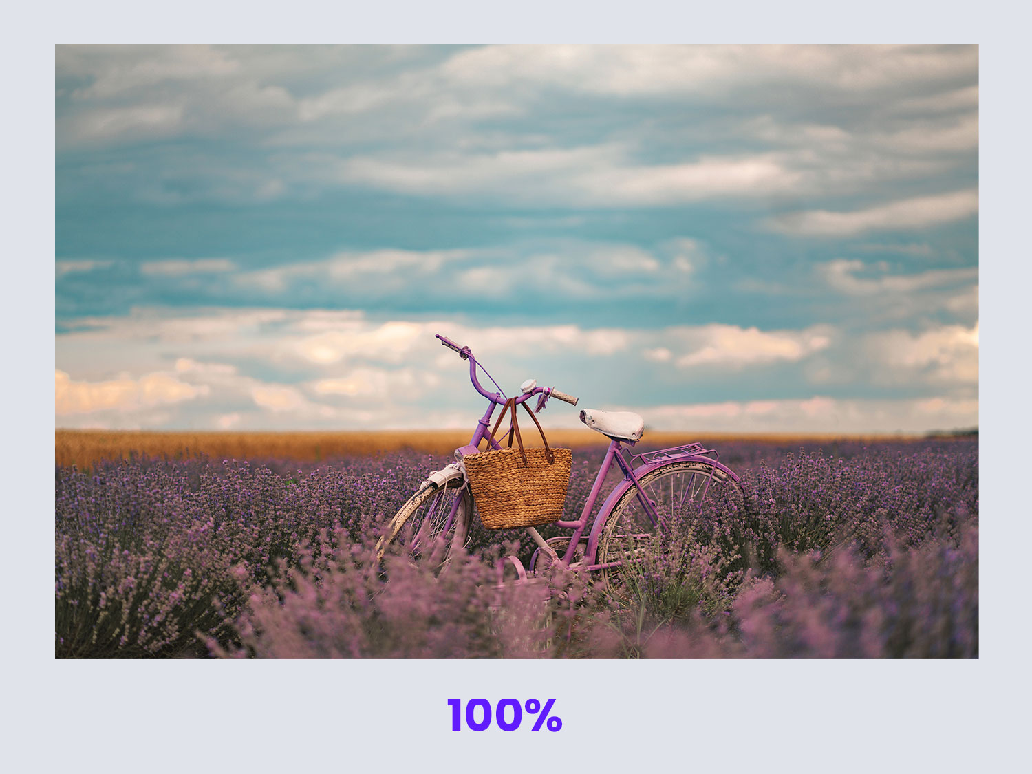
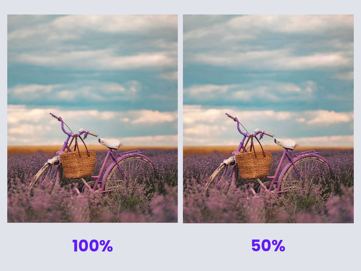
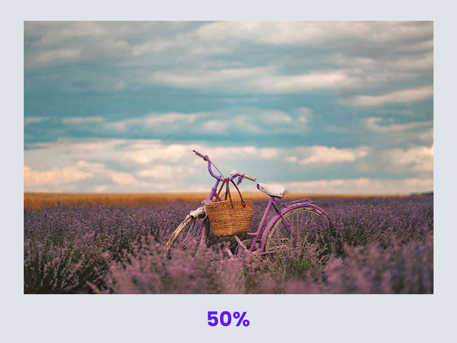
 The photo on the left had an original weight of 326KB,
while the optimized photo on the right is only 64KB, it
was optimized using
OptimizeImages,
the file size was reduced by over 80%
The photo on the left had an original weight of 326KB,
while the optimized photo on the right is only 64KB, it
was optimized using
OptimizeImages,
the file size was reduced by over 80%Every image you see around you started off as a digital file - be it on billboards, t-shirts, newspapers, books, paper, plastic, and everywhere else. All of these images come in different types of formats, each one of them will perform differently depending on what you're planning to use them on.
The quality of your end product depends on you choosing the correct image format for the correct scenario.
If you fail to do so, you may end up ruining the quality of your end product.
In order to make an informed decision about this, it is important to have a working knowledge about image formats and what they can and can't do.
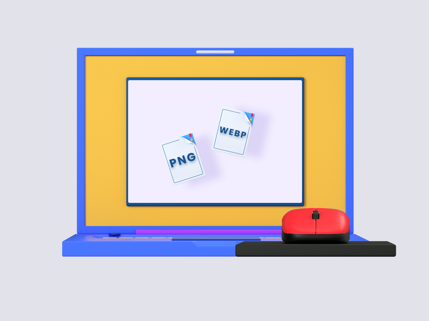
Many of us are familiar with common image formats like JPG and PNG, but there are newer, more advanced image formats that are reshaping the way our images are served, across the internet.
Now, imagine visiting an eCommerce website that lacks even a single image on it. Would you take the time to read product descriptions and search through it? Most likely no, right? Images would be a critical part of such a website, their function being both inform and engage the audience.
Not just that, but the graphics on a website often clarify details, communicate important information, and provide a quicker understanding about a subject than a paragraph would.
If you want to prevent your website from looking dull, you have to add images to it.
You need to have pictures on your site if you want to persuade, sell, inform or connect with your audience, and for that purpose, you need to choose the right file format for your website in order to take full advantage of their features while minimizing their negative aspects.
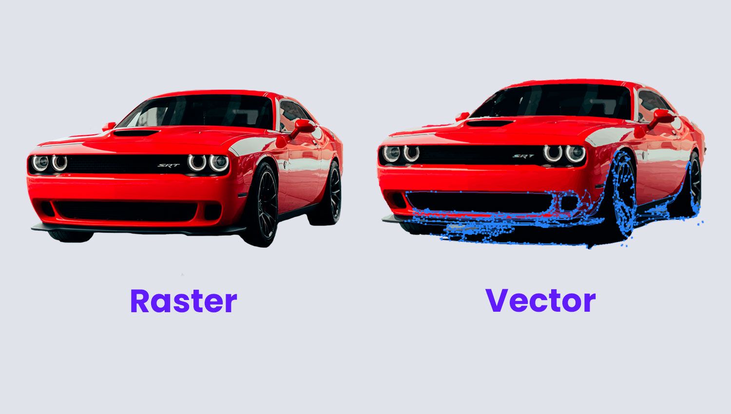
Image File Types: Vector vs Bitmap
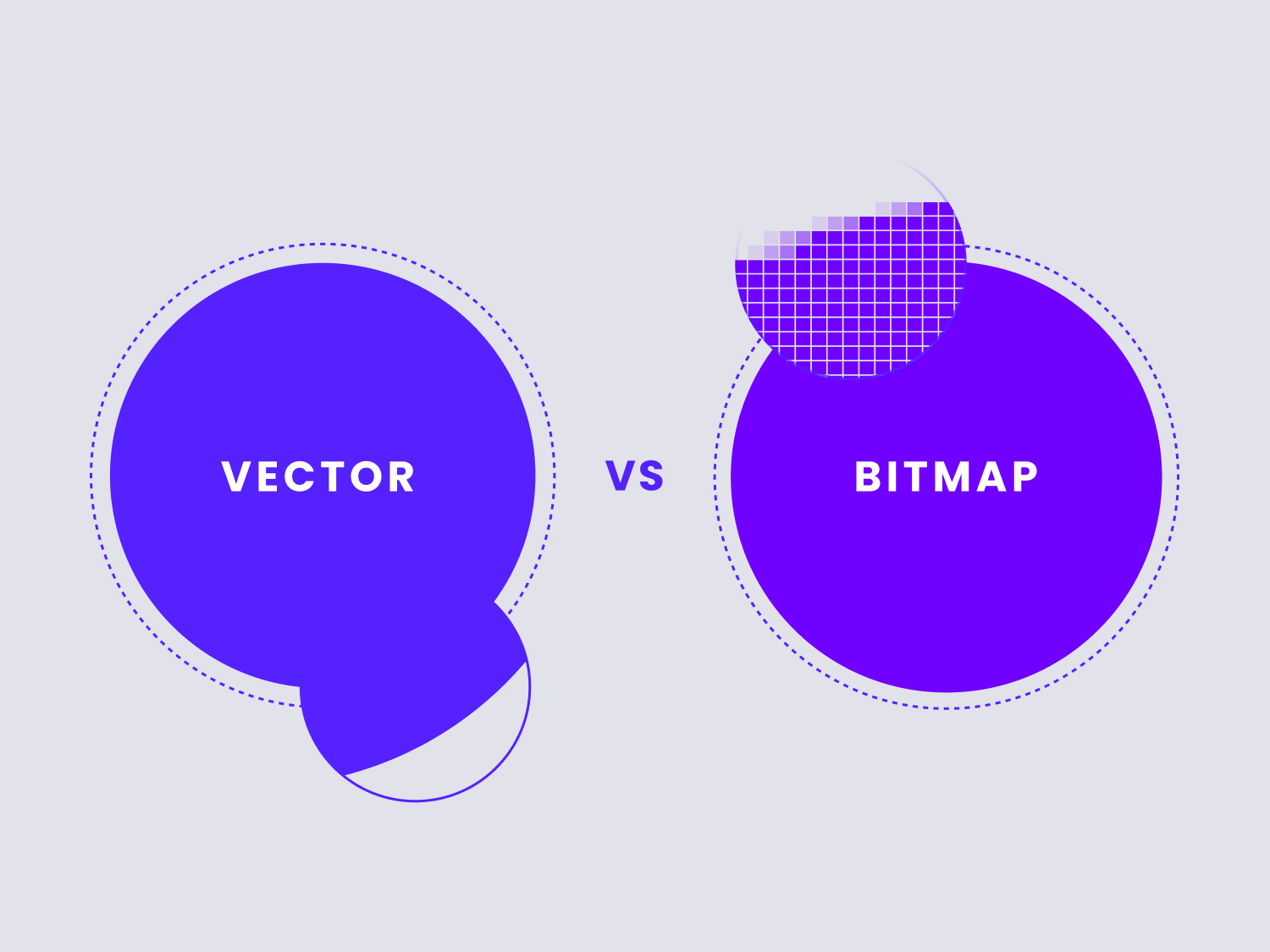
Every image that you see on a website today will fall into one of two mutually exclusive categories: they will either be a vector image or bitmap (raster) image.
Before we start discussing the optimal image formats to use on the web today, it's important that we have a working knowledge about the differences between these two categories of image as to avoid confusion and problems later down the line.
Both of these categories have vastly different features, uses and purposes.
What is a Bitmap Image?
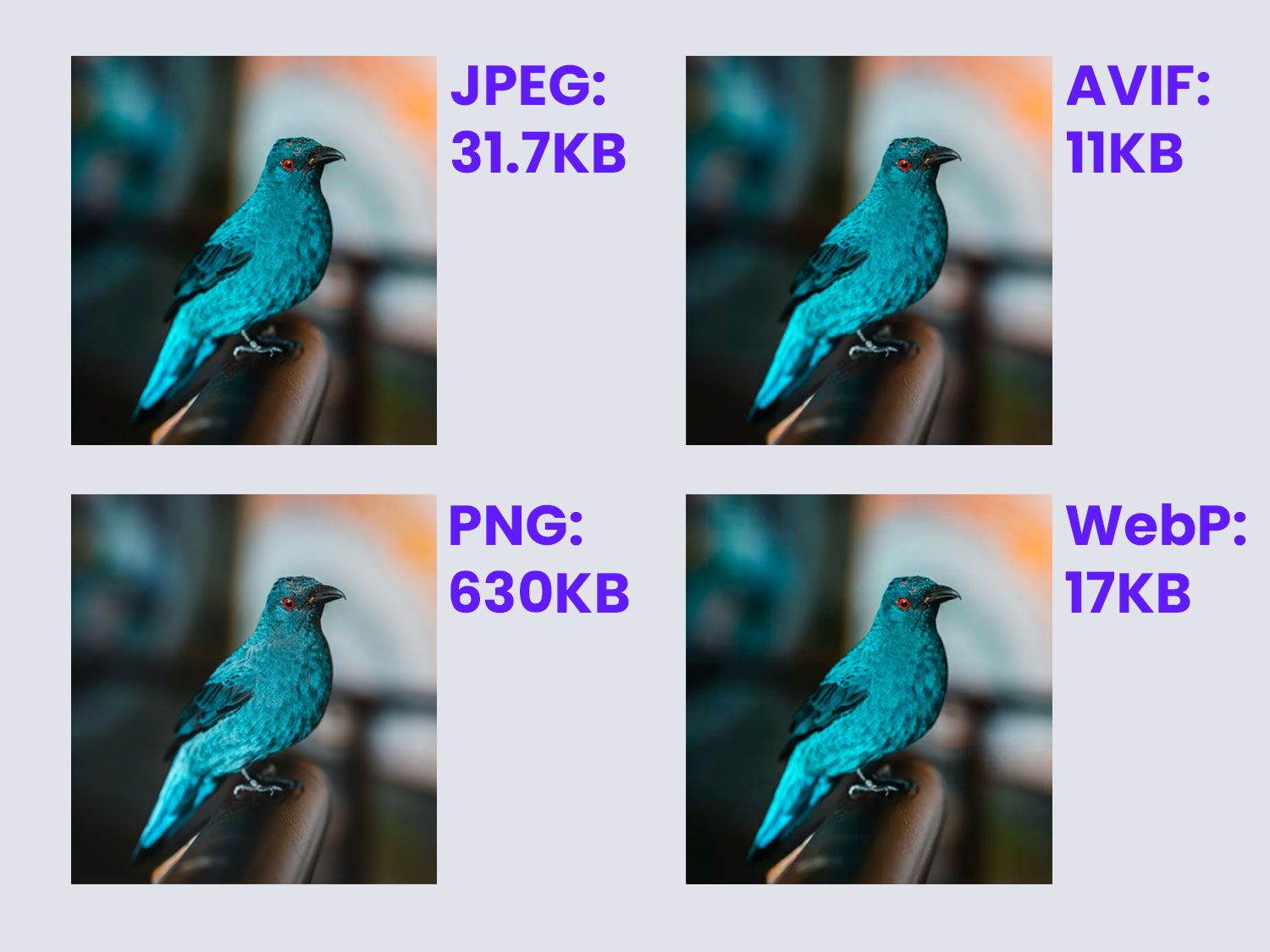 Convert images from JPEG or PNG
into AVIF or WebP to drastically reduce their file sizes
Convert images from JPEG or PNG
into AVIF or WebP to drastically reduce their file sizes
Bitmap graphics, also known as
Raster graphics,
are
a two-dimensional image as a rectangular matrix or
grid of square pixels, viewable via a computer
display, paper, or other display medium.
These are images composed of
tiny elements called pixels. These images are created
by assigning a different colour to each one of these pixels,
which are then arranged in a specific pattern that makes up
the larger composition that we perceive.
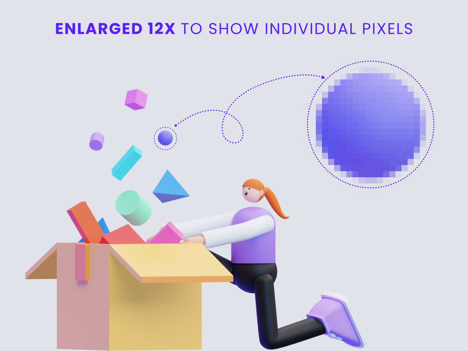
One of the most important properties of a bitmap image is their resolution, which, simply put, is the amount of detail an image holds, measured in dpi (dots per inch) for printing, and ppi (pixels per inch) for digital use.
When you try to resize a bitmap image to make it bigger, you can see the edges getting blurry and the finer details losing their sharpness, therefore you are advised not to try to increase a bitmap image's dimensions, as that will surely damage its pixel quality.
If you wish to see these pixels, you can simply zoom in on a raster image. By doing this you'll be able to see each individual pixel that makes up the larger image - notice each one of them has a unique color, even if differences in the hues are minimal.
 Image created with assets from
3D Characters at ByPeople.com
Image created with assets from
3D Characters at ByPeople.comWhenever you take a photo on your smartphone, digital camera, make a screenshot, or upload/download an image from the internet, chances are the image will be in one of the most common bitmap formats, which include:
- PNG - Portable Network Graphics
- RAW
- TIFF -Tag Image File Format
- GIF - Graphics Interchange Format
- JPEG - Joint Photographic Experts Group
Bitmap image formats are easy to convert in-between one another; for example, converting JPG to PNG or vice versa is a simple matter, and can be done in pretty much any image viewer/editor. It is also easier to convert vector formats into bitmap formats, but in most cases it's quite difficult to do so the other way around (bitmap to vector).
Bitmaps are most commonly used for everyday needs, from uploading photos to social media to sharing images with coworkers or friends, and they are the most widely supported image formats, which means they will render properly on pretty much any device and browser software.
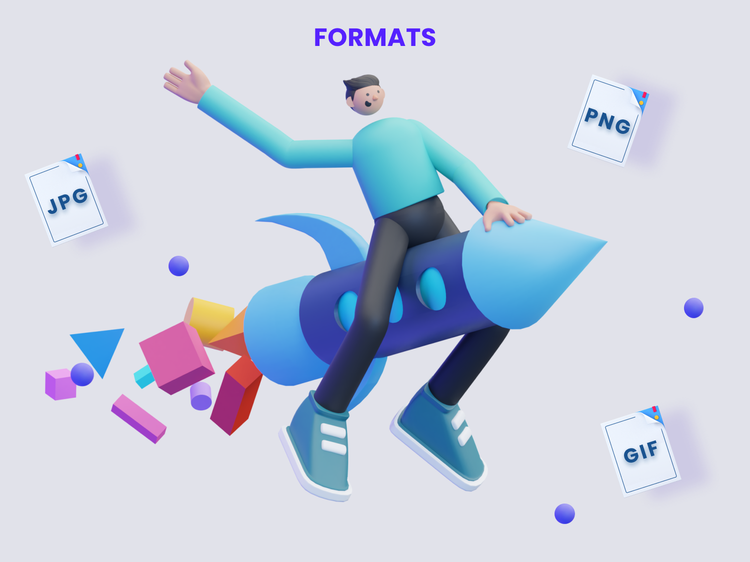 Image created with assets from
3D Characters at ByPeople.com
Image created with assets from
3D Characters at ByPeople.com
Note that the different bitmap image file formats
use either Lossy or Lossless data compression
algorithms.
Lossy compression refers to
methods that use inexact approximations and partial
data discarding to represent the content,
while Lossless compression is
a class of data compression that allows the
original data to be perfectly reconstructed from the
compressed data.
These algorithms are used to reduce an image's storage size
or transmission costs, or add certain features to the image
files,
and are a key element to take into account when it
comes to deciding which image format you should use for
your website,
so we will go into more specific details about them later
on.
What is a Vector Image?
 Original SVG on the left (41KB) and optimized output
from OptimizeImages
SVG on the right (22KB)
Original SVG on the left (41KB) and optimized output
from OptimizeImages
SVG on the right (22KB)
Vector images, unlike Bitmaps, are not made up of
individual pixels,
instead they are composed through
a set of mechanisms for creating visual images
directly from geometric shapes defined on a
Cartesian plane, such as points, lines, curves, and
polygons.
They are based upon mathematical formulas rather than
color-coded pixels.
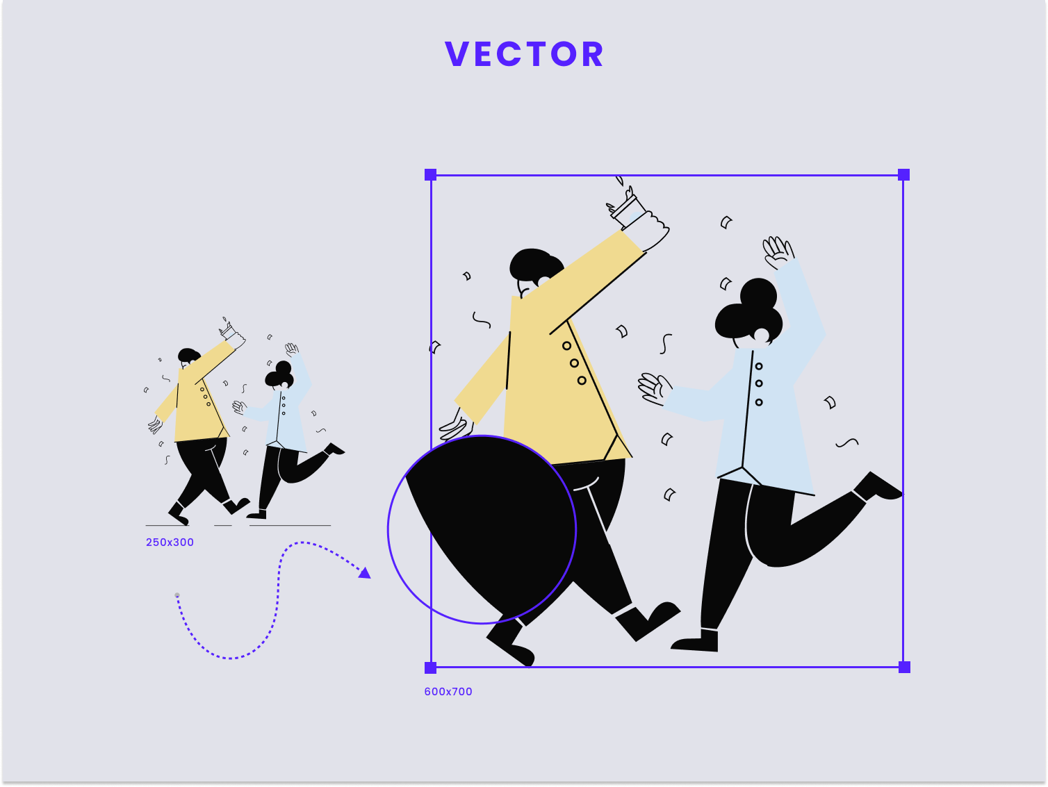
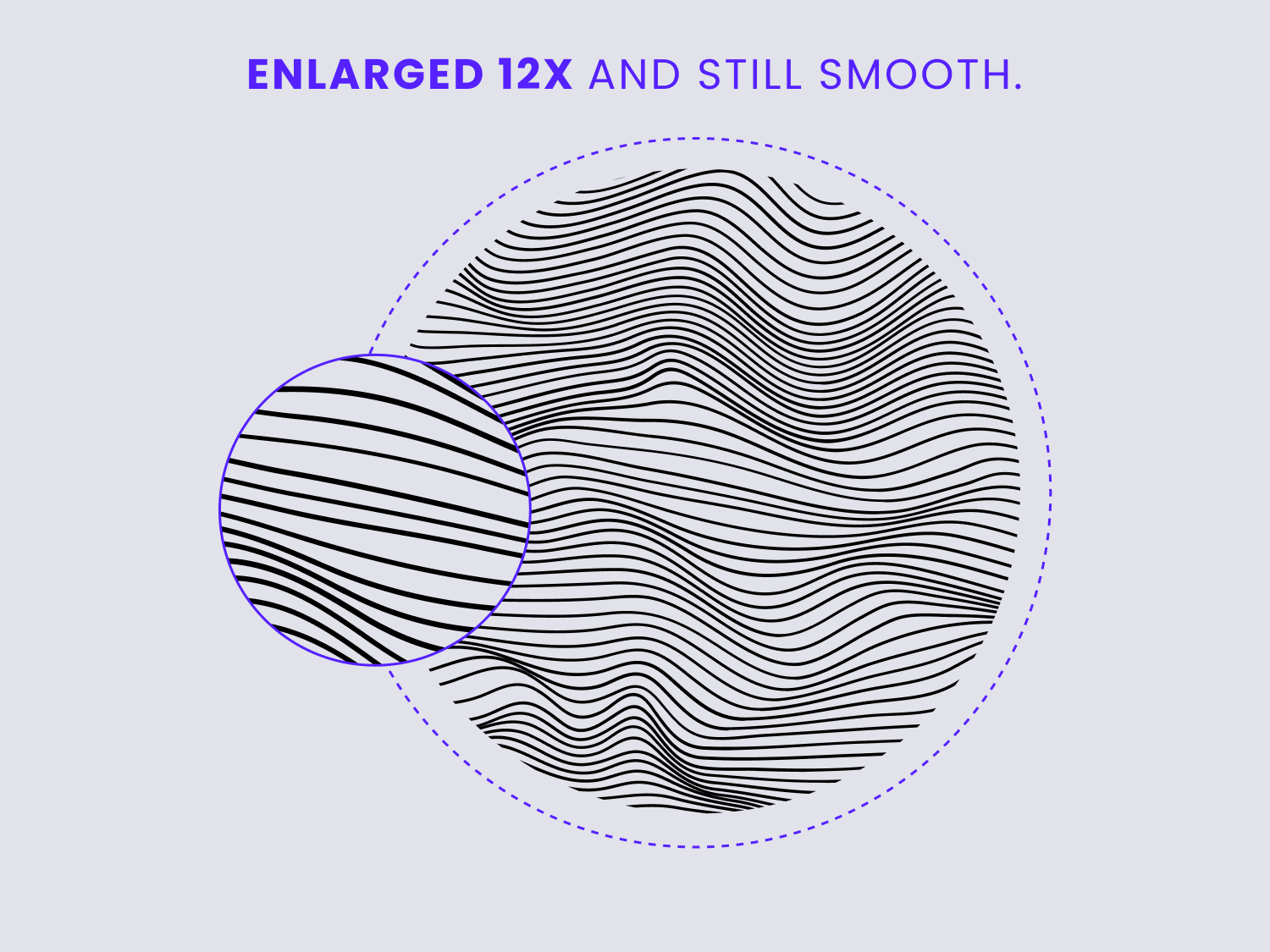
Because of the way these images are constructed, they do not depend on image resolution the way that Bitmaps do, and they can be modified, scaled up and down to any size with no aliasing or image quality loss.
 Vector images can be zoomed into and enlarged without
damaging their edges.
Illustrations by Artify.
Vector images can be zoomed into and enlarged without
damaging their edges.
Illustrations by Artify.When vector images are enlarged, the image is redrawn through the mathematical formula behind the coordinates used to compose it; hence, you'd still get a smooth image that looks exactly like the original one, no matter the size difference between the original image and the newly resized image.
The most popular and widely used vector image formats include:
- SVG - Scalable Vector Graphics
- PDF -Portable Document Format
- AI - Adobe Illustrator
- EPS - Encapsulated PostScript
- CDR
However, regardless of the scalability and quality of vector images, most of the images found online are raster image files since most vector file formats are not compatible with standard web applications, or are not really practical to use in many web design scenarios, so depending on what you're going to use them for you may need to "Rasterize" them at the desired resolution before uploading them with your content.
According to Wikipedia, rasterization is
the task of taking an image described in a vector
graphics format shapes) and converting it into a raster
image
(a series of pixels, dots or lines, which, when
displayed together, create the image which was
represented via shapes).
The rasterized image may then be displayed on a computer display, video display or printer, or stored in a bitmap file format.
Vector images are typically used for more specialized purposes such as professional graphic design environments, and therefore require more specialized software in order to work with them. They are also more difficult to convert into other vector formats, and they are not widely supported by viewing apps and web browsers, however, since SVG is a widely supported vector format, it is often used for web images such as logos, infographics, and other similar illustrations.
Comparing Vector Images and Bitmap Images
Now that we have a clear understanding of the two major image categories, let's make a quick rundown of their strengths and weaknesses side by side.
Vector Images
Pros:
- Scalable without losing quality.
- Used for more specialized purposes (i.e.i.e.raphic design).
- Resolution-independent; made of solid blocks of color.
Cons:
- Not easily convertible to other common formats.
- Not widely supported by image viewing apps, web browsers, and displays (with the exception of SVG format).
Bitmap/Raster Images
Pros:
- Easily convertible to any other bitmap format.
- Widely supported compared to vector formats.
- Captures more details with more pixel counts.
- Commonly used for everyday image needs.
Cons:
- Loses quality when scaling.
- Restricted to a particular shape.
One of the biggest issues related to using bitmap images is the fact that they become severely damaged at the pixel level when they are scaled up to larger dimensions than their original size; Vector graphics, however, do not suffer from this issue and can be scaled up and down without ruining their quality.
On the other hand, bitmaps rely solely on the image's initial resolution, so when scaling up, it simply enlarges existing pixel data, which reduces the overall quality of the image and results in damaged, blurry, and scraggy details.
Scaling without restriction is where the vector format outshines bitmaps the most, since even though there are several AI and Machine Learning algorithms that can scale bitmap images without damaging their quality too much, they require a lot of processing power.
However, the downside to using image formats that rely on mathematical formulas to construct their images is that scanning a physical image and turning it into a vector image is not a simple task by any stretch of the imagination. In this scenario your options would be limited to using bitmap formats to save your scanned images, since they rely on pixels.
An interesting aspect of bitmap image formats is that they are relatively cross-compatible, meaning that converting an image from one bitmap format to another is a rather simple task; for example, converting JPG image into a PNG or vice versa is easy enough, so basically every image editor software out there will provide options to do this.
Exporting vector images as bitmap formats is also a simple affair, but converting a bitmap image into a vector image is quite difficult to do, and requires specialized design software as well as relatively advanced knowledge.
Another downside to using vector image formats over bitmap is the need to rasterize them before being able to properly view them on most digital displays or monitors (with the exception of SVG).
Most Common Image Formats for Web Use
So far we've discussed the two categories into which most of our images will fall. Now that we got that out of the way, let's discuss the most common formats that are used in web design in more detail.
JPEG (or JPG) - Joint Photographic Experts Group
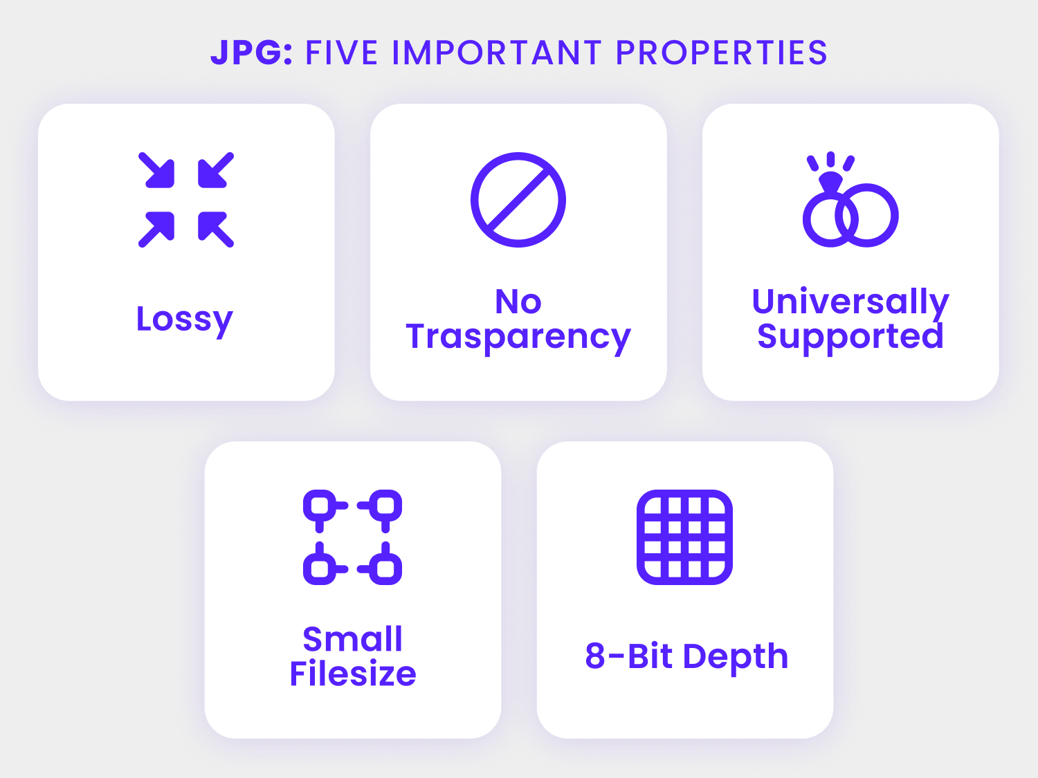
The most commonly used image format in web design is JPEG,
an acronym that stands for the
Joint Photographic Experts Group, which created the
standard in 1992.
It is used for photos, emails, banners, and web images.
JPEG format uses a compression algorithm which helps to reduce the sections of a picture into the blocks of pixels.
It can compress graphics to the ratio of 10:1 and this is the main reason why JPEG format has become so popular over the decades.
Although it can perform compression, it is still marked as a very lossy format. It means that while you are compressing the image, you are also deleting the redundant blocks and, the more you compress, the more blocks you lose.
If you are sending an image via email or you are uploading your vacation pictures on Facebook, JPEG format is considered to deliver a decent quality image when you are working with small files. However, the image quality provided by this format is still not as good as the quality provided by newer image formats like WebP, AVIF, and JPEG XL, which we will discuss in more detail below.
 Original JPEG image - 349KB
 Output optimized with
OptimizeImages
- 68KB
Output optimized with
OptimizeImages
- 68KBWhen to use a JPEG image:
- If you want to avoid sacrificing the aesthetics of your photo, JPEG format is the one that you need to use. While PNG would also work well in this scenario, JPEG works best when you are working with complex images like photos.
- JPEG format is also a better choice if you're looking to share pictures in bulk, since images in this format tend to have lighter file sizes and therefore load faster. With that said, the file size is still not as small as the one provided by newer formats like WebP, AVIF, and JPEG XL.
- If you are working with an image that does not require alpha channel transparency.
When to avoid using JPEG image:
- JPEG is not a suitable format for images with hard lines. For images like logos and icons, a vector format would be ideal, however, if you absolutely must use a raster format you'd be better served by PNG, WebP or AVIF.
- When you need to showcase a graphic design portfolio, since illustrations and digital designs in general are better served by file formats that use lossless compression, you're gonna want to use a different format like PNG-24 or PNG-8, or you can also use newer image formats like WebP & AVIF since they provide smaller file sizes and support lossless compression.
- JPEG images cannot blend with the background of a web page since they don't support transparency - for these scenarios you can go with PNG or WebP formats.
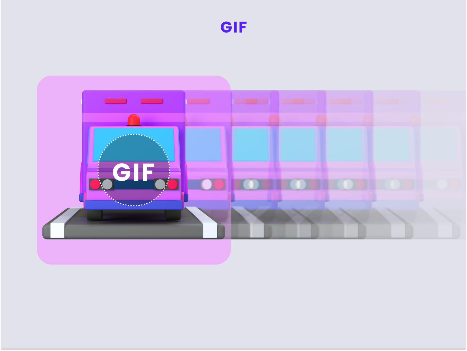
GIF - Graphical Interchange Format
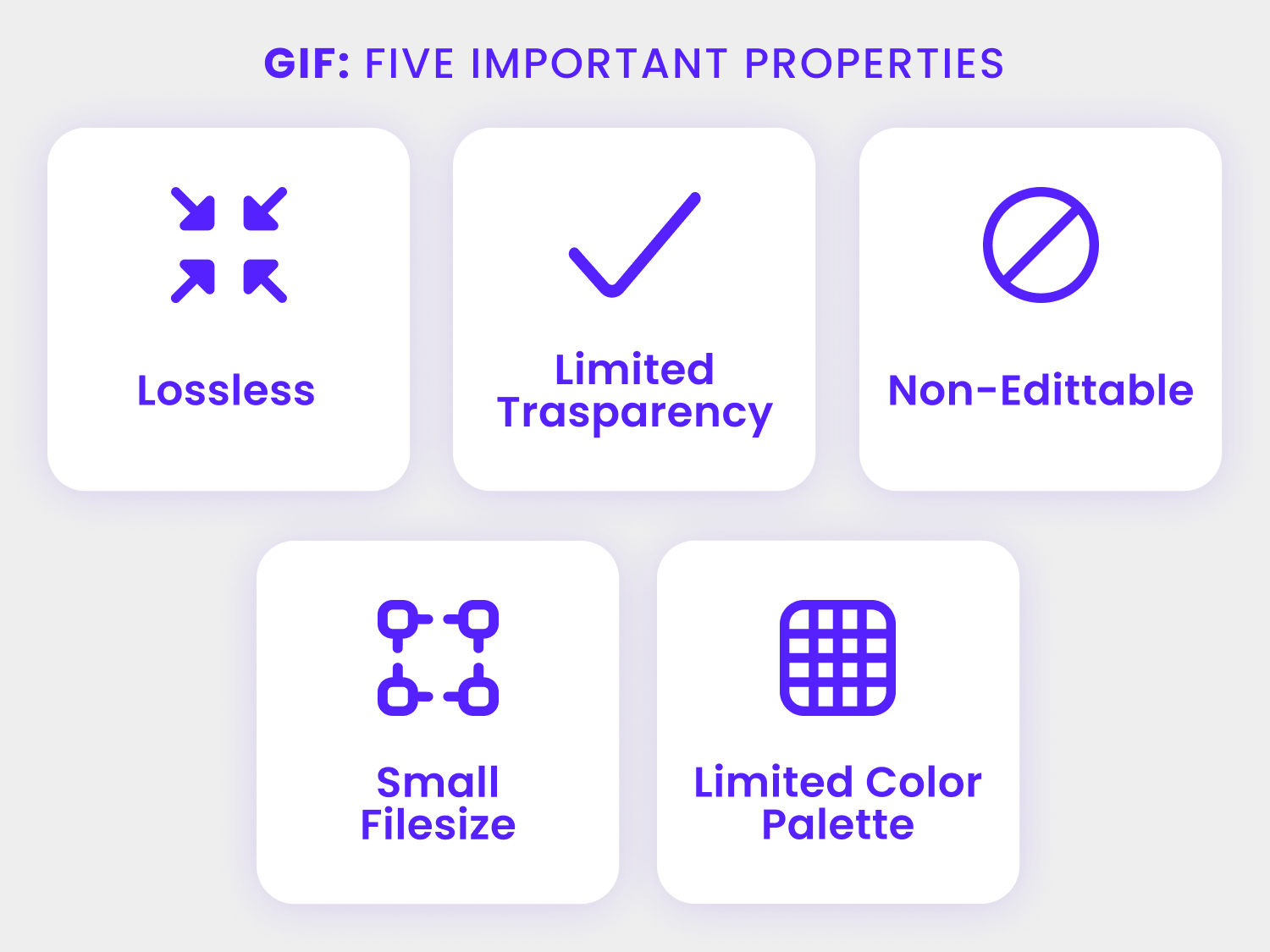
Graphical Interchange Format, or GIF, is a very highly compressed image format. It uses an LZW compression algorithm that does not ruin the quality of the image during compression. GIFs require low bandwidth and are very compatible with pictures that use solid colour areas.
 GIF images create animated sequences by displaying
image frames in quick succession - icon taken from
3D icons by Iconshock
GIF images create animated sequences by displaying
image frames in quick succession - icon taken from
3D icons by IconshockWhat GIF does is it combines multiple single frames or images, and displays them in succession, in a way that a short animation or video clip is generated.
GIF files are limited to 256 colors, so taking an image that is originally 24-bit and converting it into a GIF file will forcibly reduce the color palette to 8-bit, which more often than not will result in colors being subtracted from the image.
When to use GIF:
- When working on animations for websites, SVG is probably the best choice if your animations are based on digital designs, however, for short clips based on video footage, GIF is a better choice since the final image will be light, widely supported, and you'll have some control over how the colors will dither in the browser.
- Depending on the type of transparency you need your image to have, GIF could also be a good choice. GIF doesn't support partial transparency (a.k.a alpha channel transparency). Put simply, each pixel is gonna be either fully transparent or fully colored, so if you don't need to represent shadows or smooth gradients, then GIF can be a good choice.
- GIF is great for creating light file sizes for animated sequences since it offers a very strong compression - if your original image is already an 8-bit image, then the quality loss will be negligible.
When not to use GIF:
- You are not recommended to use GIF for photos where you want to retain lots of delicate details, since GIF images are by default reduced to 256 colors. The photos would look flat and less vibrant. For photographs you'll be better served by JPEG XL image format.
- Do not use GIF format for a photos that you have to print, since, as stated above, this format is limited to 256 colors. For high quality photo prints it's better to use JPEG, TIFF or RAW camera files.
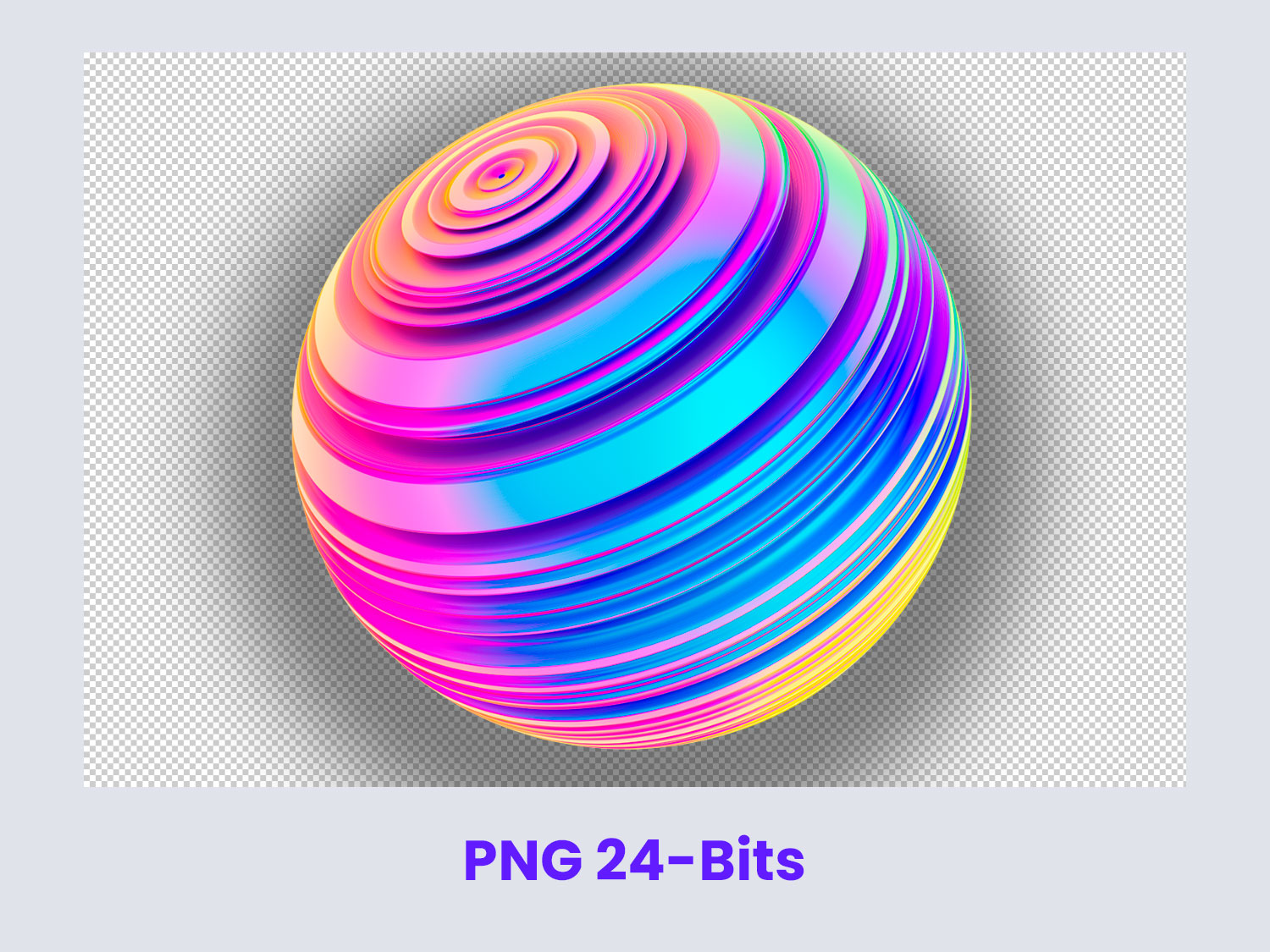
PNG - Portable Network Graphics
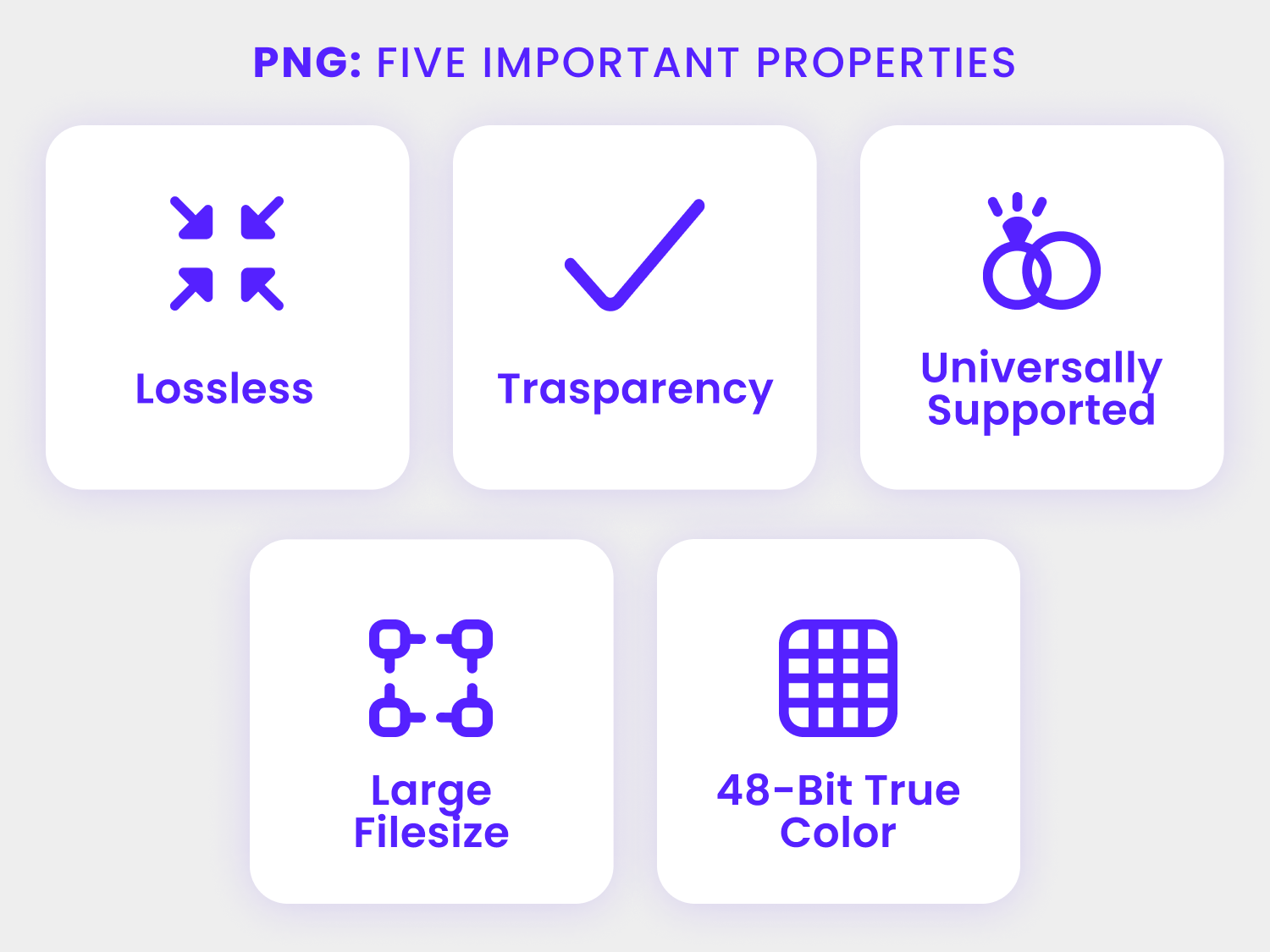
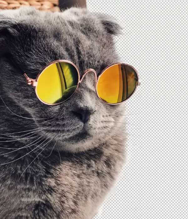
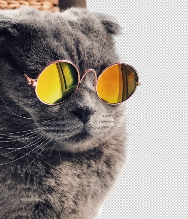
Portable Network Graphics is a raster graphics file format that supports lossless data compression, which was originally developed as a spiritual successor for GIF image format. It also supports alpha channel transparency, making it a better choice for displaying digital designs since it allows you to place elements over transparent backgrounds.
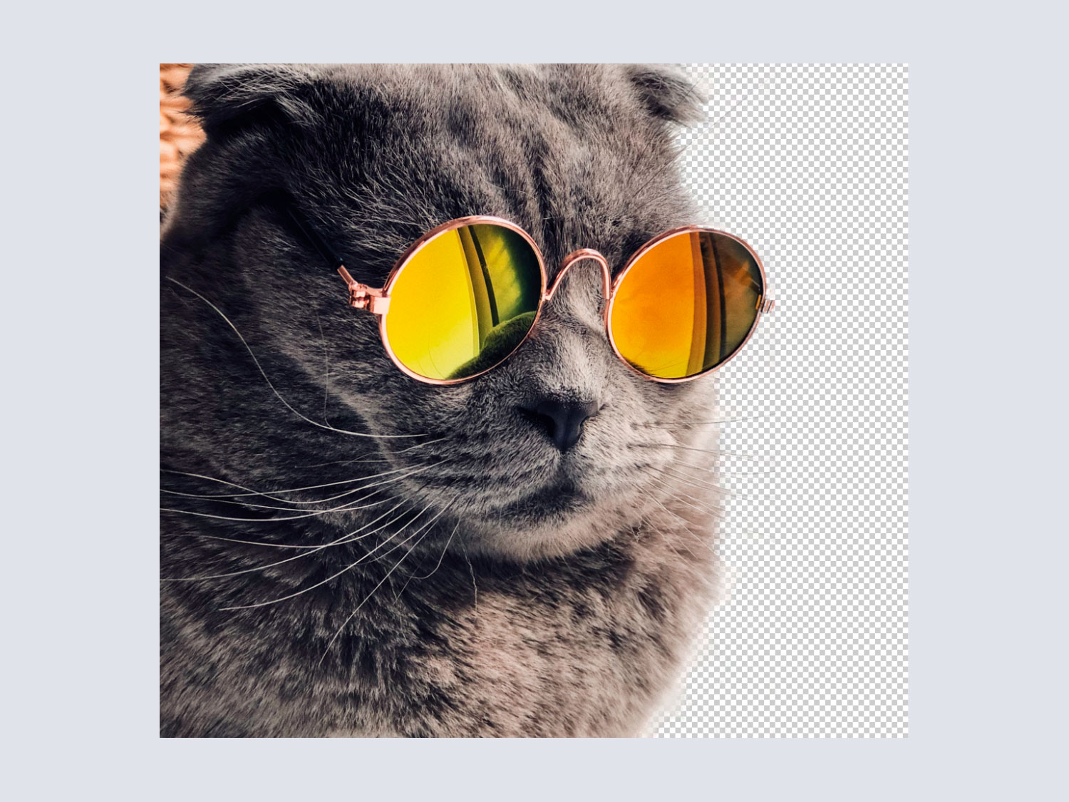 PNG images support alpha channel transparency, allowing
them to display gradients smoothly and with varying
degrees of transparency on each pixel
PNG images support alpha channel transparency, allowing
them to display gradients smoothly and with varying
degrees of transparency on each pixel
PNG format is versatile, you can apply a variety of effects to images such as partial transparency, and can create smooth gradients and color transitions since a 24-bit PNG image can store over 1.6 million colors. Also, PNG format is widely supported by browsers and operating systems, unlike other, less commonly used formats, so you can use Png images on everything from backgrounds to web elements, icons, etc.
Its support of lossless compression also means that you won't have to worry about damaging the image's quality when doing any kind of editing like resizing or recoloring.
 Original PNG image - 215KB
 PNG image optimized
with OptimizeImages
- 168.4KB
PNG image optimized
with OptimizeImages
- 168.4KBWhen to use PNG:
- If you'll need to edit an image or resize it, then PNG is a good choice as its quality will not be reduced by the process of opening it, editing it and saving it, unlike JPG images which lose quality every time they are modified.
- PNG format supports up to 1.6 million colors in 24-bit images, so it's a great choice for digital designs that require smooth color transitions like gradients, and to preserve color detail on digital designs.
- Unlike the JPEG format, PNG supports alpha channel transparency. You can choose PNG format if you are working with images that need to have completely transparent backgrounds or partial transparency for drop shadows and such.
- PNG is ideal for images that contain hard likes like texts, logos and icons.
When to avoid using PNG:
- The PNG format compresses the image but the file size often remains large. So, if you are not anticipating a bigger file size, do not use PNG.
- Most digital cameras use EXIF metadata and this is not supported by the PNG format.
- PNG format does not natively support animation, so for short video/animated sequences you'll probably be better served by GIF format.
- Another drawback of the PNG format is that it only supports RGB color profile, with no support CMYK, which means that, depending on the colors you're using, your designs may look different on print than they do on the screen.
TIFF - Tagged Image File Format
 Icon taken from
3D icons by Iconshock
Icon taken from
3D icons by Iconshock
Tagged Image File Format or TIFF is the file format that
has been used for printing since the time it has come
into existence.
According to Wikiedia, TIFF
is an image file format for storing raster graphics
images, popular among graphic artists, the publishing
industry,[1] and photographers
and it is
widely supported by scanning, faxing, word processing,
optical character recognition, image manipulation,
desktop publishing, and page-layout applications.
A wide range of colours are supported by TIFF and it can be exported as 8, 16, 24, and 32-bit colour modes. TIFF supports high-quality image - the resolution graphics of TIFF image is greater in size than JPEG or any other format images.
This also affects its portability and its use on the internet. Most web browsers do not support this format but digital cameras do, as it is a format in which images are saved in the camera's storage.
When to use TIFF:
- If you need to print photos or graphics then TIFF is probably the best choice after RAW camera files, however, RAW files are not as widely supported by printing hardware as TIFF, and the difference between the two formats' quality output is really not that big.
- TIFF is also great for creating high-quality scans of already existing physical images.
When not to use TIFF:
- Since TIFF is an image format that is almost exclusively used for printing it does not have widespread OS and browser support, so you should avoid using it if you are working with web graphics. For web graphics it'll be better to go with advanced image formats like WebP and AVIF.
SVG - Scalable Vector Graphics
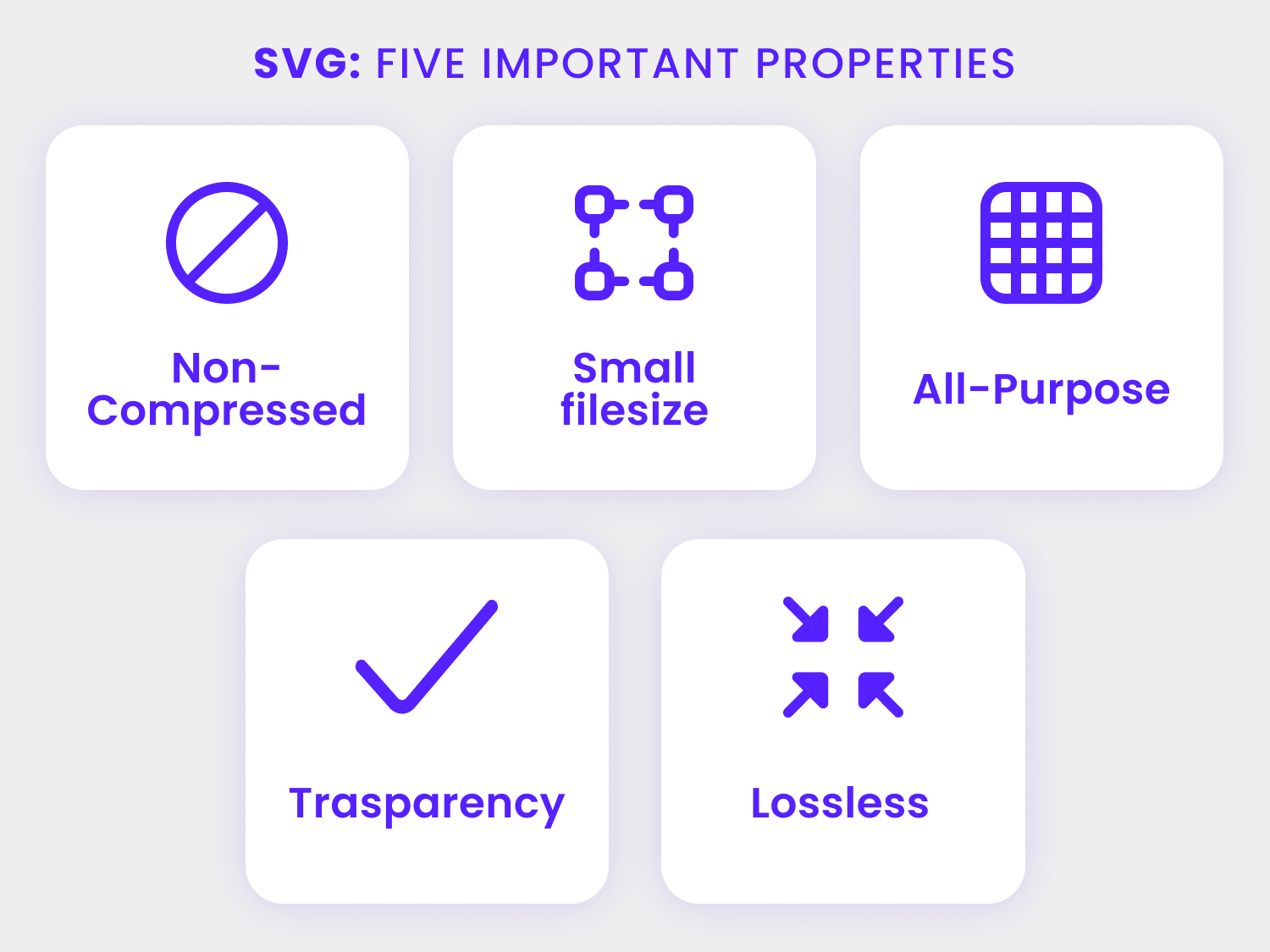
SVG, or Scalable Vector Graphics, is defined on
Wikipedia as
an XML-based vector image format for two-dimensional
graphics with support for interactivity and
animation.
This file format is an open standard created by the W3C
(World Wide Web Consortium) in 1999. Essentially, SVG images
are vector graphics stored in XML text files, as such, they
can be scaled and modified without losing image quality, and
the XML files can be created and edited with plain text
editors and specialized vector graphics software, and they
be rendered by all major web browsers to date.
Although it is a vector image format, SVG files are widely used in web design since they can produce images that look great on any screen size, even on devices with higher pixel density.
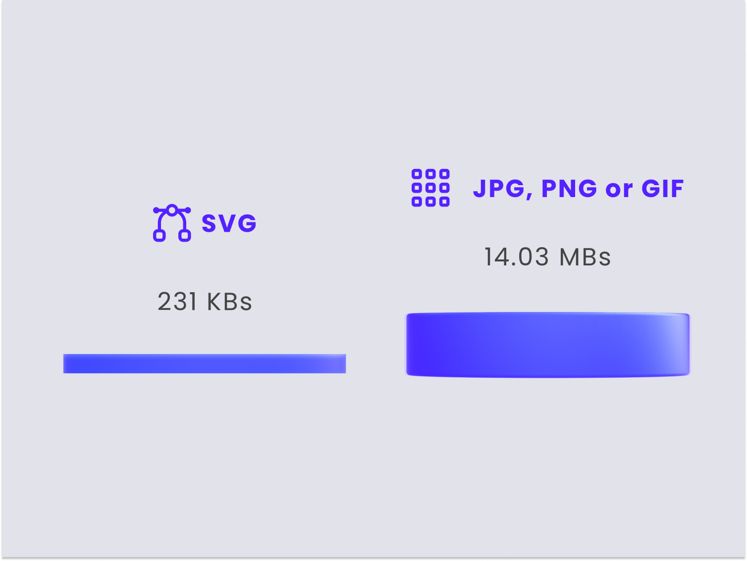
Despite being a vector format, SVG files tend to be on the lighter side of the file size spectrum, thus they are often used in web design to display icons and logos, animated digital designS and other graphic elements, and, as an open standard, it works exceptionally well with other open standard languages and technologies such as CSS, JS and HTML, making it simply for web designers to use SVG graphics in web projects.
When to use SVG:
- For web icons & logos, due to their light file sizes, crisp edges and the fact that they are widely supported by all major web browsers
- For web animations such as illustrations, icons and loaders, since SVG files can be animated via JS and CSS, making it ideal for web developers to work on them.
- For fast-rendering graphic elements, since SVG images are made up of XML and CSS, so web browsers do not perform additional HTTP requests the way they do with conventional raster graphics formats.
When to avoid SVG:
- For detailed images, since SVG images are rendered using paths and points instead of pixels, and therefore aren't great at capturing the finer details that pixel-based raster graphics can display
- There's a steep learning curve to understanding the code behind SVG images and how to properly display them on the web, specially when it comes to cross-browser responsiveness.
- Complex SVG images will output lenghty and jumbled up code that can become tiresome to sift through
New Formats You Should Start Using:
So far, we've discussed the most commonly used file formats that are typically found online, however, there are a variety of new image formats that bring a lot of features to the table and they are definitely worth looking into, let's take a look at those now.
Pillar image formats like JPG, PNG and GIF are gradually becoming phased by newer, much more versatile formats that offer a wide variety of advantages over the older but better established formats.
These new image file formats support animated multi-frame) and static (single-frame) images, contrasting older formats like JPG and PNG and GIF, respectively.
More so, they have faster encoding and decoding speeds and support lossy/lossless compression when required.
WebP
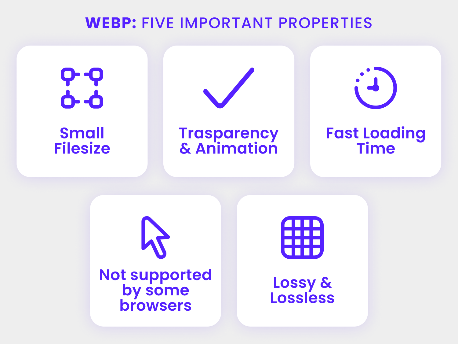
Developed by tech giant Google, WebP is one of the modern image formats that can't be left out of this list.
This image format has gained more popularity because it supports both lossless and lossy compressions, so it provides versatility when it comes to making graphics for websites such as blogs and e-commerce marketplaces.
Now, at this point you may be wondering about the point of using WebP when you have other formats too that also support lossy and lossless compression right?
Well, put simply, WebP format helps web pages load faster. This is due to the fact that, on average, a lossless WebP image will have a file size about 26% lighter than a PNG version of the same image, while still maintaining comparable or even higher pixel quality.
 Like PNG images, WebP images also support alpha channel
transparency
Like PNG images, WebP images also support alpha channel
transparencySimilarly, lossy WebP images overtake JPEG images in both pixel quality and file sizes, with WebP format offering file sizes about 25% to 34% smaller than JPEG images with a comparable SSIM quality index.
When it comes to website speed optimization this is a big deal, as a 25% reduction on image file sizes certainly plays a major role in loading speeds for users, specially first time visitors whose browser's don't yet have a cached version of a website, and would therefore take longer than a returning visitor in serving the content to a user.
Aside from its obvious image quality and file size advantages, WebP also supports alpha channcel transparency, which used to be practically exclusive to PNG image format. This means that you can use WebP for images that require partially or fully transparent pixels in order to display drop shadows or similar grayscale and color gradients.
WebP Format Browser Support:
WebP is slowly but surely working its way into everyday consumer web contents, and its currently supported by most major web browsers including Google Chrome on desktop & mobile devices, Microsoft Edge, Firefox, Opera, and the Native Android OS browser.
It is projected to supersede JPEG (and other popular formats) as the primary standard format for images (photographs and pictures) shared on the web sometime in the not so distant future.
 Original PNG image - 680KB Converted to WebP
with OptimizeImages
- 75KB
Original PNG image - 680KB Converted to WebP
with OptimizeImages
- 75KBAlso, as a raster graphics format, converting images to and from WebP is a rather simple affair, and can be achieved by downloading a precompiled conversion tool called cwebp from the official Google Developers website, just make sure to get the version of the tool specific to your operating system.
Want to know how to put that WebP image in your HTML tag? Here's how you do it:
					<picture>
						<!--load webp in different sizes if browser supports it -->
						<source type="image/webp"
						 sizes=" (max-width: 500px) 500px,
								(max-width: 768px) 768px,
								(max-width: 1024px) 1024px,
								100vw"
						 srcset="
							webp/image-500.webp 500w,
							webp/image-768.webp 768w,
							webp/image-1024.webp 1024w,
							webp/image-full.webp 1920w
						"
						<!--fallback on original src. -->
						<img
							 srcset="siteimages/image-1024.jpg 1024w,
										siteimages/image-768.jpg 768w,
										siteimages/image-500.jpg 500w"
							size=" (max-width: 500px) 500px,
											(max-width: 768px) 768px,
											(max-width: 1024px) 1024px,
											100vw"
							src="siteimages/image-full.jpg"
							alt="image description"
							class="myimageclass"/>
					</picture>
AVIF - AV1 Image File Format
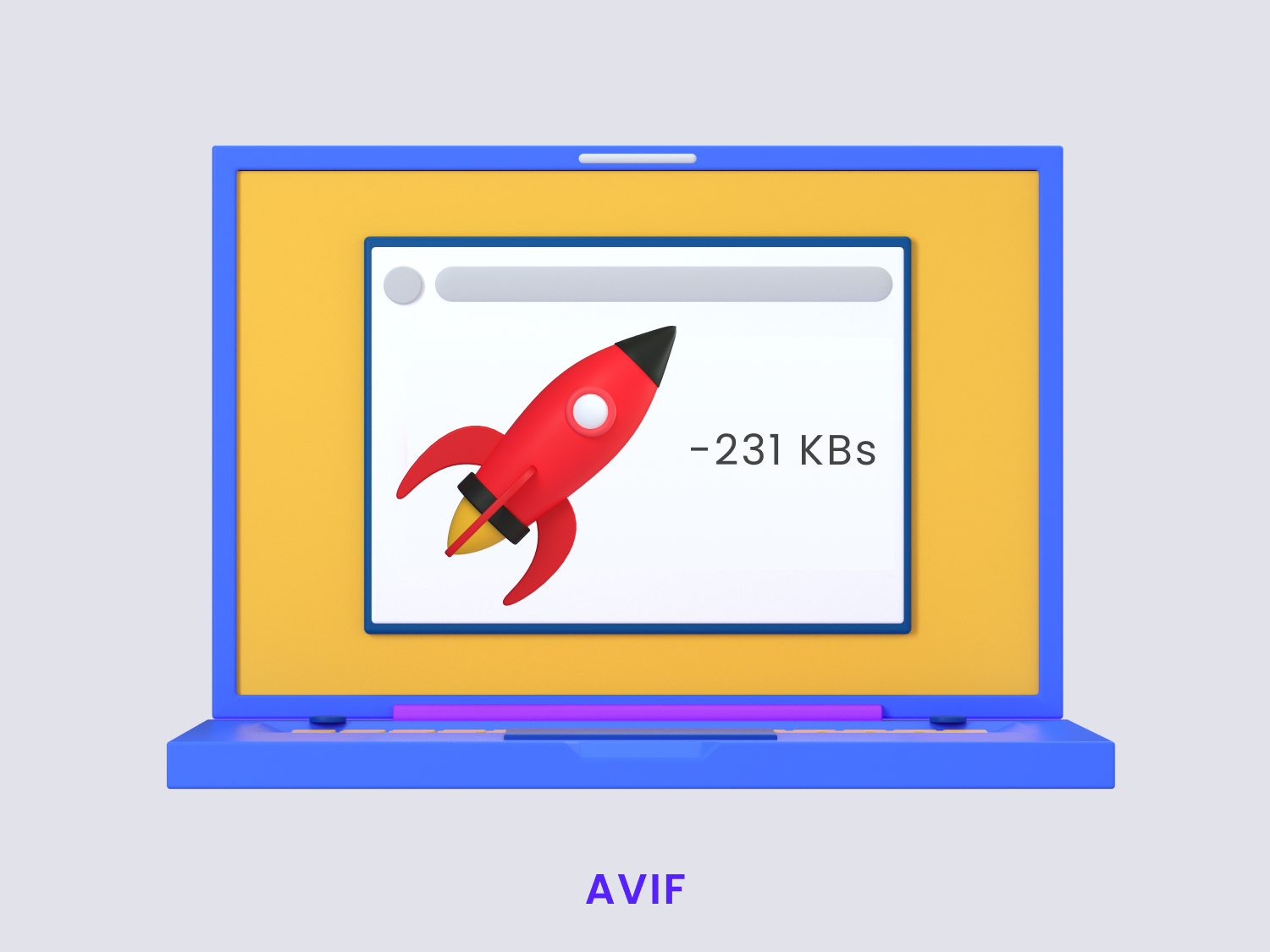 Illustration from
3D icons by Iconshock
Illustration from
3D icons by Iconshock
AVIF image format is, according to Wikipedia,
an image file format specification for storing images
or image sequences compressed with AV1 in the HEIF
container format.
This image format offers superior compression efficiency and
image quality when compared to conventional image formats
such AS JPG, PNG and GIF, and its designed to supersede even
Google's WebP format.
AVIF supports all known image codecs, and it offers
significantly better file size reduction when
compared to every other raster graphics format commonly used
on the web.
It provides this greater image compression and file size reduction without destroying the image details and quality of the graphics in it.
On average, AVIF provides an image file size reduction of up to 50% over webP.
The AVIF format supports high-dynamic-range (HDR) imaging and supports 10-bit and 12-bit color palettes at full resolution. AVIFs are also about ten times smaller in size than other popular formats, and supports both lossy or lossless compressions.
Currently, the AVIF image format is supported on desktop by Firefox, Google Chrome and Opera.
Browser support is not yet as comprehensive for AVIF as it is for other image formats, so if you want to implement AVIF images into your web projects you should always provide a fallback option in WebP, JPG or PNG format within your HTML picture tags. If you're wondering how, here's a quick example:
				<picture>
					<source type="image/avif"
					 srcset="https://images.example.com/.../img.png?q=75&w=500&fm=avif 500w,
                        https://images.example.com/.../img.png?q=75&w=900&fm=avif 900w,
                        https://images.example.com/.../img.png?q=75&w=1300&fm=avif 1300w,
                        https://images.example.com/.../img.png?q=75&w=1700&fm=avif 1700w,"
					 sizes="(max-width: 800px) 100vw, 800px"
					<source type="image/webp"
					 srcset="https://images.example.com/.../img.png?q=75&w=500&fm=webp 500w,
                        https://images.example.com/.../img.png?q=75&w=900&fm=webp 900w,
                        https://images.example.com/.../img.png?q=75&w=1300&fm=webp 1300w,
                        https://images.example.com/.../img.png?q=75&w=1700&fm=webp 1700w"
					 sizes="(max-width: 800px) 100vw, 800px"
						<img
						srcset="
                        https://images.example.com/.../img.png?q=75&w=500 500w,
                        https://images.example.com/.../img.png?q=75&w=900 900w,
                        https://images.example.com/.../img.png?q=75&w=1300 1300w,
                        https://images.example.com/.../img.png?q=75&w=1700 1700w
                      "
						size="(max-width: 800px) 100vw, 800px"
						src="https://images.example.com/.../img.png"
						alt="Some great alternative text"
						loading="lazy"
						decoding="async"
						width="1920"
						height="1080"


						/>
				</picture>
JPEG XL:
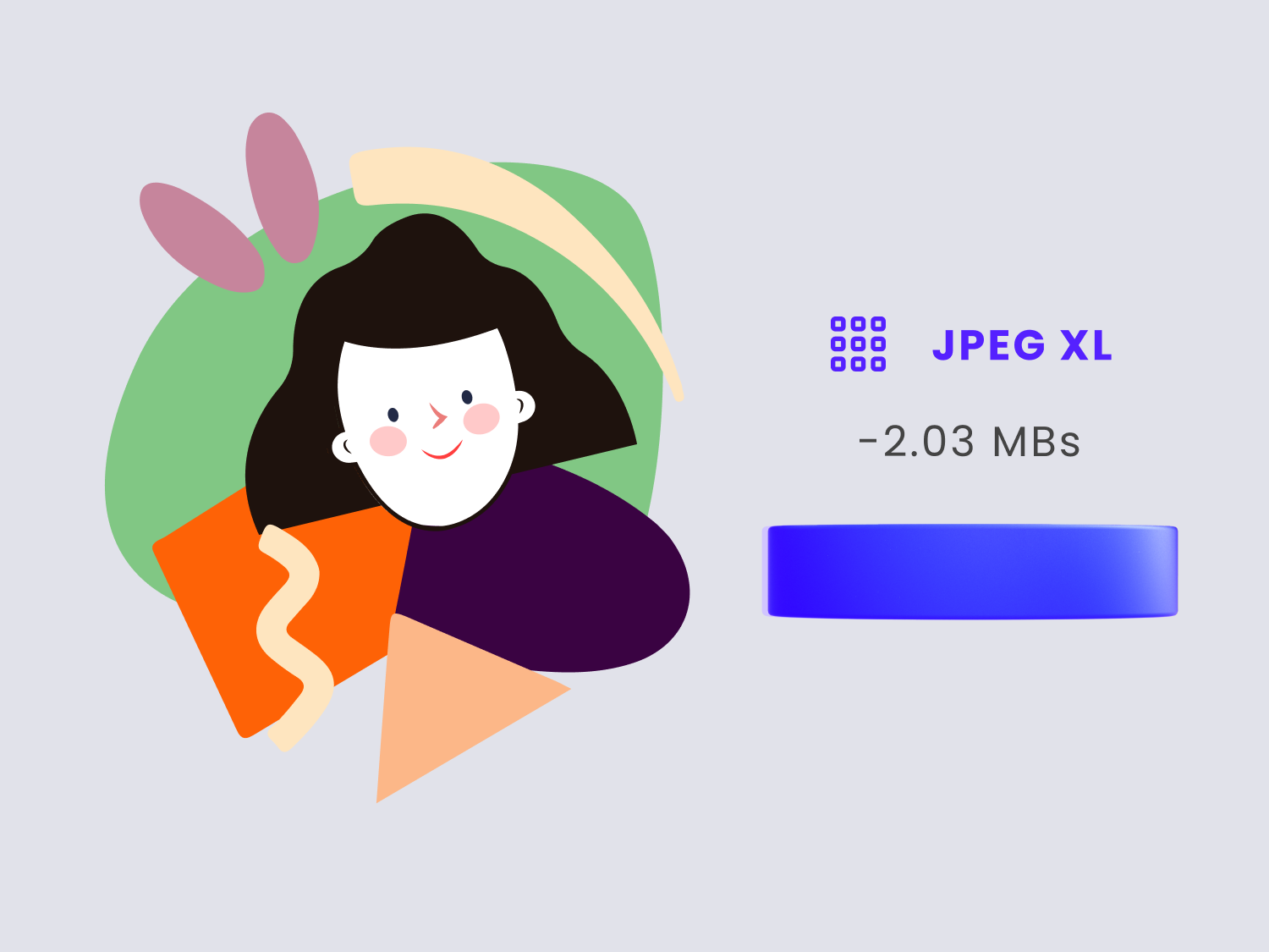
JPEG XL is a lossy/lossless Bitmap image format represented with the file extension .jxl, images saved using this file format can be lossless or lossy depending on the compression technique used.
The main aim of coming up with this new image format was to provide the user with better image compression, smaller image size, and higher-quality graphics over the standard image formats currently used.
With JPEG XL images you can effectively transcode your JPEG image without any loss.
For WebP, JPEG XR, HEIC, and many other formats, the problem is that every time you transcode your JPEG image to these formats, your image would be decoded to pixels and then recoded to the other format.
This entire process leads to the loss of image quality.
The good thing is that it does not happen with JPEG XL.
The bad thing is that, for now, JPEG XL is not widely supported by browsers and devices
Image Format Use-Scenarios
We're here.
We've discussed so many formats up until this point, and seen how every format has its qualities.
With all of this information, it wouldn't be surprising if you're confused about the use that you should make for each one of them, but worry not, to make it simpler for you we are providing you with a list of formats below, and which is the best scenario to use them on.
SVG:
SVG images are vector images that tend to be on the lighter side of the file size spectrum. Since they load fast and work nicely with CSS, JS & HTML they are often used for web to display logos, icons, animated illustrations and similar images, specially if you want them these to appear as crisp as possible on any device that your users are visiting your website from, regardless of the device's display size.
PNG:
This image format is one of the most commonly used formats for website images, social media, or images used in graphic design.
PNG format is widely supported by web browsers and its relatively easy to optimize for web. Since it supports alpha channel transparency it is also the go-to file format for images that require partial transparency or cutout design elements used in graphic design. While it is widely used on the internet for these reasons, there are newer image formats that outperform PNG in almost every aspect, but specially when it comes to web images.
WebP:
This image format is used predominantly on the web, and it was originally developed as an improvement over PNG, JPG & GIF image formats. It aims at creating smaller yet high-quality images that load faster on web browsers, while also supporting both lossy and lossless compression as well as alpha channel transparency, so moving your image content to exclusively WebP could be a good move if you're looking to optimize your website's UX.
AVIF:
AVIF is an image format ideal for web images as well as animations, and while it outperforms WebP, JPG, PNG & GIF in file size and image quality ratios, it is still being developed and while most of the recent versions of modern browsers support it, AVIF does not enjoy the widespread browser and feature support that other image formats do, however, with proper HTML picture tags, it can be a powerful image format to optimize a website's speed without breaking its UX when users visit it from web browsers without AVIF support.
JPEG XL:
While JPEG XL is a really powerful image compression format that often times outperforms the rest in several metrics, it is still the most recently released image format and it is not supported by any of the major web browsers yet - developers can enable it via Config flags in Chrome, Firefox, Opera and Edge, however, for now, it remains an experimental image format, and should not be used to serve web content until it is further developed and supported.
HTML Picture Tags & SEO
Much of what we've discussed so far has been geared towards optimizing images with the goal of creating a better user experience for your website's visitors - we've already dipped our toes into Core Web Vitals, discussed image file formats as well as pointed out the optimal uses for each format, so now its time to move on to the realm of SEO, and more specifically, how you can leverage your images and HTML picture tags and attributes in order to get the most out of our content.
For a long time the img tag was a core element of HTML pages used to display images within the page's content, however, with the advent of mobile devices, different screen sizes and resolutions, responsive design has become a necessity, and this, naturally, extends to website images as well.
Imagine a web page that contains 15 images - originally, each one of these images has 3840x2160px dimensions. However, the majority of your website's traffic comes from users who visit you using devices with a screen resolution of 1280x720px.
In order to optimize your website's image loading times for these users, the smart thing to do would be to serve them those large images scaled down to 1280x720px, which would significantly improve loading times, and require less resources from both ends.
However, for users are visiting your website using a Retina display, you will also want the ability to serve images those larger 3840x2160px images to make sure everything looks neat and sharp.
This is where the picture tag will come into play since, roughly speaking, it allows you to define which images are sent to a user's browser based on the hardware they are currently using.
To achieve this, you can make use of the srcset and sizes attributes within your picture tags:
				<picture>
					<source
					 srcset="small-test-image.jpg 400w,
                                      medium-test-image.jpg 800w,
                                      large-test-image.jpg 1200w"
					 sizes="(min-width: 1280px) 1200px,(min-width: 768px) 400px, 100vw"
					<img
						src="medium-test-image.jpg"
						alt="test image"/>
				</picture>
Naturally, the picture tag plays a major role beyond setting up responsive images - the more commonly used img tag achieves this just fine, however, the picture tag allows you to take control of Art Direction as well.
In this context, Art Direction is the process of displaying different images depending on the visitor's hardware display sizes.
Responsive images and the Art Direction concept differ in that essentially, a responsive image means setting up your HTML picture tags in a way that they display the same image in different resolutions. Art Direction on the other hand displays completely different files, and it is particularly useful to make available different aspect ratios of the same image, which you wouldn't be able to do with simple responsive design without severely damaging or stretching your images.
Also, and perhaps more important to our interests right now, with Art Direction allows you to make use of partially supported image file formats, such as AVIF & WebP, while also setting up proper failsafes that will prevent your images from breaking UX if a visitor arrives using a browser that doesn't support these files. Let's take a look at the example below:
				<picture>
					<source  media="(orientation: landscape)"
					 srcset="land-small-test-image.avif 200w,
                                      land-medium-test-image.avif 600w,
                                      land-large-test-image.avif 1000w"

					 sizes="(min-width: 700px) 500px,
                                    (min-width: 600px) 400px,
                                    100vw">

					<source  media="(orientation: landscape)"
					 srcset="land-small-test-image.webp 200w,
                                      land-medium-test-image.webp 600w,
                                      land-large-test-image.webp 1000w"
					 sizes="(min-width: 700px) 500px,
                                    (min-width: 600px) 400px,
                                    100vw">

					<source  media="(orientation: landscape)"
					 srcset="land-small-test-image.jpg 200w,
                                      land-medium-test-image.jpg 600w,
                                      land-large-test-image.jpg 1000w"
					 sizes="(min-width: 700px) 500px,
                                    (min-width: 600px) 400px,
                                    100vw">

					<source  media="(orientation: portrait)"
					 srcset="port-small-test-image.avif 700w,
                                      port-medium-test-image.avif 1200w,
                                      port-large-test-image.avif 1600w"
					 sizes="(min-width: 768px) 700px,
                                    (min-width: 1024px) 600PX,
                                    500px">

					<source  media="(orientation: portrait)"
					 srcset="port-small-test-image.webp 700w,
                                      port-medium-test-image.webp 1200w,
                                      port-large-test-image.webp 1600w"
					 sizes="(min-width: 768px) 700px,
                                    (min-width: 1024px) 600PX,
                                    500px">

					<source  media="(orientation: portrait)"
					 srcset="port-small-test-image.jpg 700w,
                                      port-medium-test-image.jpg 1200w,
                                      port-large-test-image.jpg 1600w"
					 sizes="(min-width: 768px) 700px,
                                    (min-width: 1024px) 600PX,
                                    500px">

						<img
						src="land-medium-test-image.jpg"
						alt="an image used for testing purposes"
						/>
				</picture>
Here, we cover several bases: we're setting up our responsive images, but we've also organized our tag in a way in which the browser will attempt to load the AVIF image file first; if this file format is not supported, it will attempt to load the WebP image second, and lastly, if neither of these formats are supported, it will fall back to the universally supported JPG image format.
This is a great method to optimize the loading speeds of your images while also offering support for visitors using a wide range of devices and browser versions, making sure that your visitor's UX will not be broken by something as pedestrian as a broken or poorly optimized image.
Now, beyond optimizing image loading speeds, there are other aspects that will also require your attention, specifically your image filenames and your HTML image Alt attributes. These two are simple enough to set properly, and they make all the difference for the SEO ranking of images, however, they are often forgotten despite their simplicity.
The Alt attribute is essentially a plain text, use-friendly description of the image itself. For example, if your website has a picture of a red candy bar, your Alt attribute should be a simple text description, such as the example below:
<img src="red-candy-bar.png" alt="a candy bar"/>
This attribute is important for a couple of reasons:
- Search engines will crawl website's and attempt to understand the context of images through their Alt attributes - if its missing, they will have a really hard time understanding what exactly the image is trying to communicate
- They make your content more accessible, particularly to visitors who use screen readers, such as visually impaired people.
The image filename is no less important since, much like with the Alt attribute, search engines will read an image's filename in an attempt to understand their context, and images that retain random strings of numbers and characters as filenames are not very useful to them, and therefore will seldom be found and displayed in their image search results.
The image filename, like the Alt attribute, should also be a plain text description of the image's content, so, following the example above, the image filename could should look like this:
<img src="red-candy-bar.png" alt="a candy bar"/>
Remember: everything we've discussed, all of it, is geared towards optimizing your website in a way that gets you more visitors and better SEO rankings, so you should optimize all of your content and gear it towards that end. This extends all the way to rather simple optimization aspects such as image filenames too!
You also need to keep in mind other aspects like:
Using the right image format:
The first thing, that you should be taking care of is making sure you're not using the wrong format. If you choose an image format that is not supported by a web browser, is obsolete, or ruins the quality of the graphic, you are taking a big risk.
Compress your images:
Make sure you're compressing your images to optimize their filesize, but take care not to ruin the image quality in the process.
Beware of the Copyrighted content:
Using materials from sites that do not explicitly provide copyright-free content can negatively impact your SEO efforts, and it can also bring you other issues like DMCA takedown notices later down the line.
Customize your file names:
Do not give your images generic file names, or worse, random strings of characters and numbers, date timestamps and such - these will never rank on Google's search results.
Try to use a file name that describes, in just a few words, the content of your image.
If you save your image with a name that is not related to your graphic, it almost certainly will never be able to make it to the search results of queries that your target audience is interested in.
Image Optimization Techniques
So far we've discussed image file formats, their main features, use-cases, and a tips that you can implement into your HTML tags in order to help them achieve better SEO rankings, however, the rabbit hole goes deeper than that, and there's still a lot of ground to cover before we can call it a day.
In this section we will be discussing a few techniques that you can start implementing today, both in your image optimization process as well as in your HTML code in order to squeeze every bit of quality you can out of an image that you've optimized for web use.
Optimize Images Online
Optimizing images online is a rather simple affair - our online image optimizer can drastically reduce the filesize of your images with essentially no quality loss, or at least not visible to our human eye. Let's start by comparing a few JPEG images:
Original JPEG image - 349KB Output optimized by our tool - 68KBYou can also convert your images from JPEG to a more advanced image format to achieve greater results:
Original JPEG image - 349KB Same image, converted to WebP - 50KB
Optimizing this JPEG image with our tool brings us a filesize reduction of over 85%! But you can push it even further by using a different format instead, like AVIF:
Original JPEG image - 349KB Same image, converted to AVIF - 39KB
Clearly, AVIF format offers, by far, a better compression ratio and look at the image, it almost completely retain its pixel quality!
Optimize PNG Images Online
Let's take a look at OptimizeImage's performance with PNG images, comparing a PNG image with an optimized PNG image:
Original PNG image - 215KB PNG image optimized by our tool - 168.4KBWe already get over 19% filesize reduction with a normal, soft compression applied to the image, but What about an optimized PNG image compared to a new image format like WebP and AVIF? Let's see how they perform side by side:
 Original PNG converted to WebP - 37KB
 Original PNG converted to AVIF - 27KB
The same PNG image with an original size of 215KB can be reduced all the way down to 27KB by converting it to AVIF, that's a crazy 87% filesize reduction at basically no quality loss.
Optimizing Images Locally
Before uploading an image to your website you're gonna want to make sure you've done everything you can to reduce the file size as much as possible with minimum negative impact on it's pixel quality.
There are many ways in which you can achieve this, some are more simple than others, depending on the file format of the image you're working on and the degree to which you want to reduce the file size:
JPEG
Every image editor, no matter how simple or advanced, will provide you with at least few options that you can use to reduce the file size of a JPEG image.
These images are somewhat delicate since JPEG is a lossy image format, therefore they will lose quality every time you open it, edit anything about it, and save it again. This loss of quality happens because when you save an image as JPEG, it has to be recompressed, and every time it goes through this process of compression, it loses information in order to reduce file size. The number of colors is reduced, and rough, pixelated edges start showing up.
A JPG's image quality is measured as a percentage of the quality level, which can range anywhere from 0% all the way up to 200%. Your everyday photo or image in JPG format will typically have a quality percentage between 80% to 100%, so if you need to make your JPG images lighter, this is the first thing you'll want to check.
Let's take a look at the example below:
This photo is a JPG image file, with the quality setting set at 100%.
If you want to reduce the file size of a JPG image file quickly, you can simply open it in any image editor like Paint or FastStone Editor, navigate to File > Save as, and locate the Image Quality option, which you can find under the Save as File Type dropdown menu in most image editors.
By reducing the quality percentage below the original 100%, you can drastically reduce the JPG's file size, and if you're careful not to go too low, your photo will still look good.
For reference, here's the same picture, this time at 50% quality.
Note that not every image will be able to retain its finer details when compressed at a 50%. A JPG image with a quality of 90% or higher is typically considered a "high quality" image, and an image with a percentage below 70% is typically considered "low quality".
With that said, different photos and images will behave differently, and you will be free to play around with the quality setting in order to find one that gives your photos a good balance between quality and file size.
It also depends on the purpose of the image, whether or not it is a photograph or a digital design, whether it is meant to show the finer details of a product, or function simply as a thumbnail, whether you want it for print or for digital use and so on.
Scaling down an image will also reduce it's file size, so if you need to optimize JPG images to use as product thumbnails, reducing the dimensions of the photo instead of the quality could be a good place to start!
How JPEG Compression Works:
JPEG image format uses a lossy compression algorithm based
on DCT (Discrete Cosine Transform) a process which
expresses a finite sequence of data points in terms of
a sum of cosine functions oscillating at different
frequencies.
This compression algorithm can be roughly broken down into
the following steps:
- The convertion of non grayscale images into YCbCr components
- The subsampling of CbCr components
- Grouping pixels into 8x8px blocks for processing
- Transforming each block using DCT
- Coefficient scaling by "Quantization" factors
- Huffman-encoding data
- Adding header info and quantization factors
Color Conversion & Subsampling
RGB is not an optimal colour mode for JPEG compression since it is somewhat easy for these colors to suffer changes due to quantization, so during this step, the image's data is divided into three colour planes: a Luminance (greyscale) and two color components, thus converting it into YCbCr colour space.
This step is often times referred to as YUV instead of YCbCr, however, this is technically incorrect since, while YCbCr is, to put it simply, a lightened and gamma-adjusted version of YUV colour space, YCbCr is a digital system, while YUV is an analog system, and the two terms are not interchangeable.
JPEG then reduces the amount of image data by playing human biology, since the human eye is much more sensitive to the Luminance information (or Intensity) than it is to the colour information itself, the Luminance information can be reduced and colour information can be sub-sampled with no visible loss of detail within the image, or at least none that we can perceive, while still reducing the amount of image data significantly.
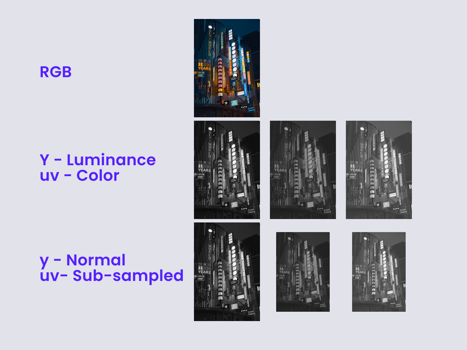
Block Grouping & DCT Processing
After subsampling the YCbCr image data each one of the three YCbCr colour planes is encoded separately but using the same scheme, grouping it into eight by eight pixel blocks (64px in total). Each block is then transformed using the DCT process, which, simply put, transfers the data of the image from a spatial domain into a frequency domain.
While in the spatial domain, the image's data is described through a digital value for each pixel, representing the content through a list of pixel number and pixel values.
Each one of our 8x8px data blocks are then separately DCT encoded, so the image will now be described by the coefficient of the spatial frequencies for vertical and horizontal orientation.
In the spatial domain, we are storing 64px values to describe the image. On the other hand, in the frequency domain we store 64 frequency coefficients.
Again, during this process we are simply changing the way the data is represented, so there's no data or visual quality loss on the image.
Quantization
Once our discrete cosine transform coefficients have been calculated through DCT, the coefficients are unwrapped in a zig-zag pattern, which simply converts the 8x8 array into a single 64 element array with the coefficients of most significance occurring first.
Our 64 coefficients are then scaled through Quantization in order to reduce the amount of data necessary to store them. Essentially, this process is focused on removing high-frequency data, and it's the part of the compression algorithm where the user's input is actually required, and typically done by selecting the desired quality percentage through a slider or box in the software you're using.
The Quantization process achieves two main goals: it allows more detail to be preserved in the low frequency data, and it averages coefficient values which are close to zero down to actual zero.
This is the second "lossy" step of the compression algorithm where we are deliberately removing information from our image file. This data loss is irreversible, so once the quantization has been done, there is no way to retrieve the data that has been lost.
Huffman Encoding & Header Info
Depending on the quantization efficiency there will be more coefficients reduced to zero which will allow for better compression on the data. These coefficients with value 0 are found in the higher frequencies rather than in the lower frequencies, and so the data is reordered in a manner in which the values are sorted by the spatial frequency, with the low frequencies first and the high frequencies last.
After sorting the data, the file will have some values at the beginning and then a lot of zeros produced by the Quantization process. So, rather than storing strings like “0 0 0 0 0 0 0 0 0 0”, we can turn that into “10x 0”, which also reduces the amount of data significantly.
The resulting data coefficients are then Huffman-encoded in order to further compress the image's data. Huffman compression is lossless, so there's no data loss after quantization.
PNG
Reducing a PNG image file size is equally simple as reducing a JPG, but requires a different process since the quality of a PNG image file is not measured by a percentage value, but rather by its Bit Depth.
As stated in W3C
(or World Wide Web Consortium for the uninitiated) bit depth
is defined as
the number of bits per sample or per palette index (not
per pixel).
This concept refers to the amount of color information that a given image has stored within itself. Put simply, the higher the bit depth, the more colors it can store.
The simplest, most basic image you could find, a 1 bit image, can only show the colors black and white. This is due to the fact that 1 bit can only store one of two values, 0 (white) and 1 (black).
PNG Image files with an 8-bit color depth can store up to 256 colors, while a 24 bit image can display over 16 million colors.
The bit depth of PNG files can range between 4-bit, 8-bit, 24-bit and 32-bit, however, for the most part, graphic design software and image editors will provide options to save your images as 8-bit PNG files or 24-bit PNG files.
It goes without saying that there is an important relationship between bit depth and image quality, so let's take a closer look at exactly what it is by using this young lady below as an example:
PNG images are, more often than not, used in professional graphic design environments as they are a lossy image format that can produce great quality, crisp digital designs, so I decided to use this illustration to show the differences between an 8-bit PNG image and a 24-bit PNG image.
In this example, the image above was exported using 24-bit color depth, and thus the colors look smooth inside of the shapes as well as on the edges of the image.
However, if you reduce its color depth to 8-bit, you will quickly notice the quality loss:
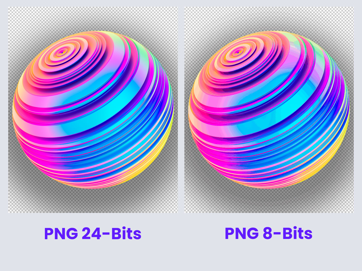
In the image above, both boxes have been zoomed in by 200% in order to make it simpler to spot the loss of colors that it suffers once it is reduced from 24-bit to 8-bit color depth.
This reduction in color depth also translates in a huge reduction of the file size for this image, from 372KB down to 67KB. This is a huge gain, specially if you're using the PNG image for web!
However, as with all other scenarios, being able to tell which images can benefit from color depth reduction vs which ones will not is critical.
A PNG image that features elements with transparency, shadows, or color gradients, will be severely deteriorated by this reduction, rendering them useless if your objective is to preserve those details.
However, if you are using transparent PNG images for product thumbnails, or need to show a product over a transparent background, it could be advantageous to take your PNG files from 24-bit down to 8-bit in order to cut the loading times for them.
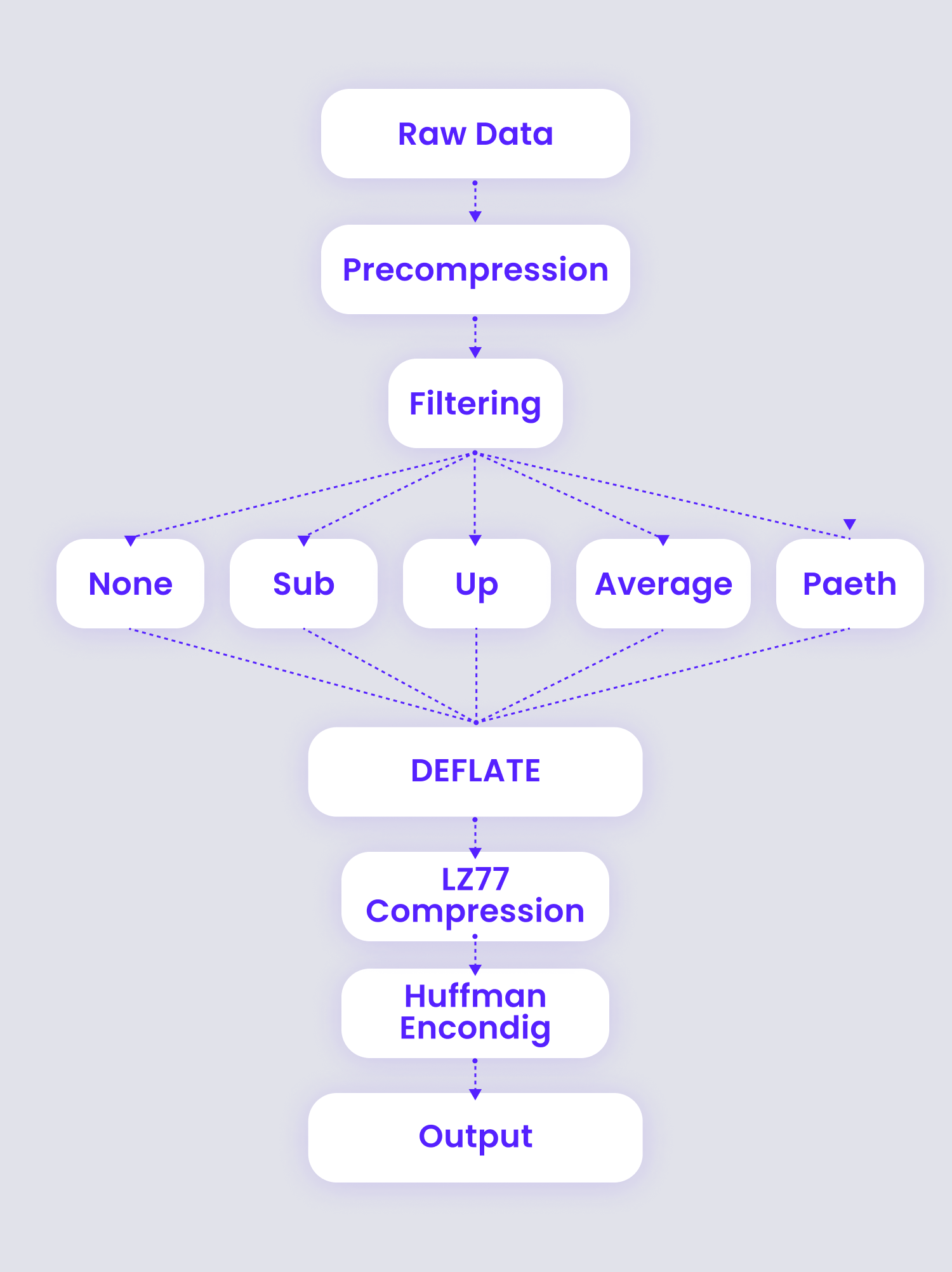
How PNG compression works
The image quality that PNG images offer is achieved through the format's compression engine, which can be roughly broken down into three stages:
- Filtering (the precompression step)
- Compression (or Dictionary-based encoding through LZ77)
- Huffman entropy coding, which further compresses the LZ77 output.
This triad is generically known as LZH.
Precompression Filtering
The precompression step that transforms the image's data in a way that makes it easier for the main compression engine to operate efficiently, achieved through an encoder that analyzes the image's data and applies a different filter from the 5 supported filter types of PNG compression to each row of pixels within the image:
- None - leaves all data unchanged.
- Sub - replaces each byte with the difference between X and A (where X is a given byte and A is the byte found to its left.)
- Up - replaces each byte with the difference between X and B (where X is a given byte and B is byte directly above X in the previous row.)
- Average - replaces each byte with the difference between X and (A + B)/2=μ (where X is a given byte, and μ is the average of the corresponding bytes located to its left and above it.)
- Paeth - replaces each byte with the difference between X and the Paeth predictor of the bytes located to the left, above, and upper left of X (A, B and C respectively.)
Even though the filtering process appears to be straightforward enough there are quite a few nuances working behind the scenes.
Chief among these is the fact that the filtering process works its magic directly on the image's bytes instead of modifying the pixels. For example, with images that have 8-bit pixels or smaller, the filter algorithms will process more than one pixel at a time.
Now, while it's true that computers have infinitely higher processing power than our meager human brains, they couldn't possibly test all possible combinations of filters on each string of data in an image as even a simple 20-row image file would require 95 trillion test iterations, each one involving a complete filtering and compressing process of the entire image.
What encoders do instead is test-compress each row incrementally, saving the smallest result, discarding the rest, and repeating the process for the next row, filtering and compressing the entire image five times.
Compression Algorithm
Next comes the Compression step where the Deflate algortihm is applied, and its the most important aspect of PNG.
The method employed by PNG belongs to a class of compression algorithms known as LZ77 algorithms, which achieve compression by replacing repeated strings of data using references to a single copy of that data already processed earlier in the uncompressed data stream.
The term "sliding window" is often used when explaining
Deflate; in layman's terms it essentially means that
at any given point in the data stream, there will be a
record of what characters went before said point.
When a sequence of characters processed for compression/decompression are identical to ones found within that "sliding window", the sequence is replaced by two numbers instead to represent a distance (the value that represents how far back into the window that sequence starts) and a length (which represents the number of characters for which that sequence is identical).
The Deflate algorithm uses a unique approach that leverages LZ77 by buffering ahead and finding the longest match for the buffer within the "sliding window". When the match exceeds a given threshold length, it encodes the string as a length & distance pair, and the buffer advances by a corresponding amount.
When the longest match is still not long enough, the first character in the buffer is output as a literal value, and the buffer advances by one.
Either way, the algorithm continues to search for the longest matches in the buffer as it advances further.
Deflate further leverages LZ77, not only by storing the distance/length value pairs, but also by Huffman-encoding the output of the LZ77 compression by looking at the frequency of literals, characters, numbers, or bytes in a file, and compressing the file using as few bits as possible to represent those literals.
GIF
Anyone who spends any amount of time in the internet is familiar with GIFs, an image format that is capable of storing multiple images in one file and, as a direct consequence, made it possible for us to share funny cat videos since the early 90's by storing and displaying each individual frame of the animation sequence, thus creating the illusion of motion.
GIF files are the standard image format for compressing images with large areas of solid colors and sharp details such as those in line art and logos
They use a variation of LZW compression, a lossless compression method, and support alpha channel (to preserver transparency, much like PNGs do). However, they are limited to 8-bit color depth, and because of this, converting images with an original bit depth of 24-bits to GIF format will certainly cause them to lose color quality.
There's a number of things you can do to you need to reduce the file size of a GIF image, you can start by:
Reducing dimensions
The first thing you'll want to do is see if you can get away with cropping it, or modify the overall image size to reduce its dimensions, since reducing an image file's dimensions is the simplest way to reduce its file size.
Using Photoshop is a simple and quick way to do it, but free raster graphics editors such as Paint.Net can also be used for editing on GIF files.
Reduce the number of colors
Depending on the image you're trying to optimize, reducing the color depth below the 256 colors of 8-bit images will also provide you with efficient for reducing the overall file size.
There are a number color reduction algorithms you can apply to a GIF image in Photoshop, to do so open up your GIF image and navigate to File > Export > Save for Web (Legacy).
From this menu you'll be able to choose the color reduction algorithm that you'd like to apply to your image, here are the options you can choose from:
- Selective - this is the default choice when exporting a GIF file from Photoshop using the legacy Export for Web. It creates a color table that favors broad areas of color and preserves web colors.
- Perceptual - creates a custom color table by giving priority to colors for which the human eye has greater sensitivity to.
- Adaptive - creates a custom color table by sampling colors from the spectrum of colors most commonly recurrent in the image.
- Restrictive - uses the standard web safe color table common to the 8-bit (256-color) panels of Windows and Mac operating systems. With this option, browser dither will not be applied to the GIF's colors it is displayed.
Remove some frames
You can further reduce a GIF image's weight by opening it up using a GIF editor and removing frames from the animation sequence, leaving only those that are essential to convey the message you want
Avoid Dithering
Dithering is a process that intentionally applies noise to an image, which is typically used to improve the appearance of images made using formats where the color range is limited.
This process applies a halftone effect on them, but while it could make some images look better, it also increases the file size, so try to avoid applying it heavily to your GIF images to save some bytes along the way.
How GIF Compression Works
GIF images use a variant of a compression method known as LZW, named after its developers A. Lempel, J. Ziv and T. Welch.
This variant, known as Variable Length Code LZW Compression, is a compression algorithm in which variable-length codes are used to replace patterns of repeated strings detected in the original data.
The algorithm employs a code table, also known as translation table, put together from these patterns of repeated strings, and each pattern is entered into the table. Its index is then used to replace the pattern in the compressed data stream.
The translation table is built by the compressor from the original input data, entering patterns into the table as it finds them, and their indices are added to the output stream instead, thus achieving data compression.
Converting a raster image from pixel values to a character stream involves several steps which can be roughly summarized into the following:
- Determining the Code Size
- Data Compression
- Converting compression codes to 8-bit bytes
- Packaging the bytes
Through these steps, the algorithm starts by establishing the number of bits that will be necessary to represent the data, then compresses the pixels that compose the image into a series of compression codes. These compression codes are then converted into a string of 8-bit bytes, and packaged into blocks with their respective character counts and output data.
Determining the Code Size
The first byte within a GIF's compressed datastream is used to represent the minimum number of bits required to express the set of actual pixel values. Typically this value will be equal to the number of color bits.
Data Compression
Since GIF compression constructs a color table for the images it compresses, images with large areas of solid colors will be compressed far more efficiently than those that contain gradients or large numbers of different colors such as photographs.
LZW algorithm works by scanning a sequence of symbols in the input data, grouping those symbols into strings, and finally converting those strings into codes. The codes assigned to each string of data take up less space than the strings themselves.
The differences between LZW and the variation of LZW used in GIF compression are essentially the presence of two additional special codes, as well as variable compression sizes in GIF GIF LZW:
- GIF requires a special Clear Code to be defined, which tells the compressor to reset its compression/decompression parameters and tables back to a start-up state. This special code can show up at any point in an image's data stream and requires LZW to process succeeding codes as if a new data stream was beginning.
- The first compression code value available in the stream is "clear code+2".
- GIF compression output codes are of variable-length, beginning at "code size+1" bits per code, up to 12 bits per code.
- GIF also contains an End of Information code. This code explicitly denotes the end of the image's datastream, and LZW processing shuts down once it is encountered.
Build 8-Bit Bytes
GIF LZW compression creates a series of variable length codes of between 1 and 12 bits each, because of this, the codes must be converted to 8-bit bytes, which are the characters that will actually be stored or transmitted. These codes are organized in a stream of bits and then processed 8-bits at a time for output.
Packaging the Bytes
The bytes are grouped into blocks for output. Each block of 0 - 255 bytes is preceded by a character count byte.
Once the bytes have been created, they are grouped into blocks for output, preceding each block of 0 to 255 bytes with a character count byte; if a block's character count byte is set at zero, the Raster Data stream is terminated.
These blocks are what's actually output for the GIF image.
Conclusion:
As technology keeps advancing, it's time to switch from native JPG, PNG, and GIF to the cutting-edge formats AVIF, WEBP, and JXL.
These newer formats can store logos, product images, standard pictures, and lossless photos. They also guarantee up to 50% size reduction, flexibility, and faster encoding/decoding speeds.
Simply put, they are here to stay, and it's high time that we embrace them. We hope this article has given you information about the different image formats, what they each offer for your situation, which one should be used in every scenario, and where to go next if you want tips on using any format more effectively.
OptimizeImages from CreativeToolkit
If you're looking for an advanced and comprehensive solution to optimize your images online, then OptimizeImages is your best option! Our image optimizer features the most advanced compression algorithms that provide images with the best visual quality while greatly reducing the image file sizes - best part? You can optimize your images completely free!
You can upload your images with drag & drop, paste image URLs in bulk, or use our website crawler to scan up to 20 images for free.
OptimizeImages offers 3 different compression settings, and also allows you to convert your images from their original format to common formats like JPG, PNG, GIF or SVG as well as advanced formats like WebP & AVIF.
You can also bulk watermark images by simply uploading your watermark file, and as if that wasn't enough, our tool will also provide you with clean HTML code for each of the images you upload, with proper tags for SEO that you can easily copy and paste.
OptimizeImages is free to use with very small limitations, and also offers premium plans that come as part of Creative Toolkit's packages.